 Jenna Ariza
Crestron Electronics '23
Icon Set — UI
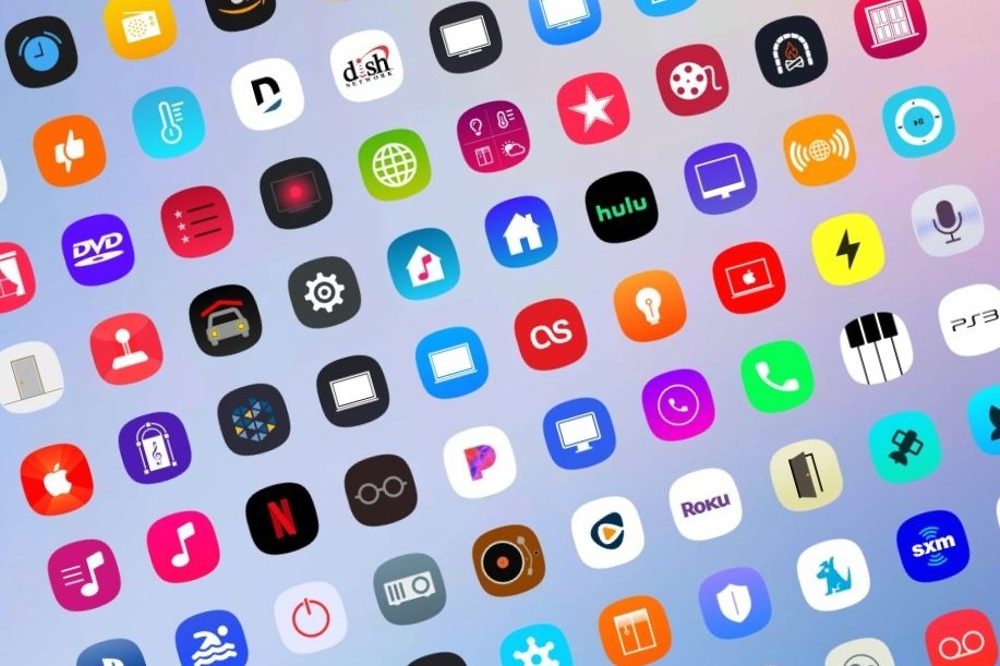
Modernized Crestron logos and iconography with fresh SVG designs to refresh a decade-old library.
Role
UI Designer
Duration
< 1 Month
Tools
Adobe Illustrator · Figma
Overview
The Crestron Icons project focused on redesigning and enhancing a set of icons for select Crestron Electronics interfaces. Prioritizing visual clarity and accessibility, the project aimed to improve the user experience by making icons more intuitive and easy to interact with across various Crestron products.
Problem
The primary challenge was to address the inconsistency and lack of clarity in the existing icon set used across Crestron Electronics' interfaces. Some of the icons, over a decade old, had become outdated. The goal was to create a cohesive, user-friendly icon system that aligned with Crestron's brand and improved usability — ensuring each icon was easily recognizable, ADA-compliant, and optimized for a variety of devices and screen sizes.
Process
Audited the legacy set, standardized grid and stroke, then produced a cohesive SVG library ready to drop into product.
🔍 Review: Old Icons
Upon joining Crestron, I began my Co-op by working on the company's iconography for various applications. My role involved creating new icons while also updating outdated ones that had been in use for the past 5–10 years. It was crucial to complete this work promptly to ensure the development team had all files ready for implementation and, more importantly, to provide users with the most up-to-date products that adhered to modern design trends.
🗺️ Planning
At the outset of my Co-op, I met with my UX Lead and mentor to discuss my initial questions, gaining valuable insights that helped shape my approach. I received the following response:
"The icons need to be in SVG format, sized 50 x 50. Make sure all of the icons and logos are up-to-date, and I will let you know if certain icons need to be kept the same."
🛠️ Tools Used
I. Adobe Illustrator (Ai)
At the time, I was still learning to navigate various Adobe applications while enrolled at university. Fortunately, I could apply the knowledge gained from my Design Fundamentals course at Rutgers to better understand how to convert .png files to .svg files effectively. I leveraged the "Image Trace" feature and its numerous options to enhance my workflow and achieve cleaner results.
II. Figma
While Adobe Illustrator proved useful, Figma significantly lightened my workload. Familiarity with Figma allowed me to quickly utilize the color picker and pen tool to recreate several icons sent to me. Additionally, its multi-select feature made it easy to export multiple icons simultaneously into my designated file folders.
III. "Why not just use an online image vectorizer?"
Although many online image vectorizers exist, they often do not yield satisfactory results. I initially attempted to convert simple icon images to .svg format as requested, but each generated conversion typically exhibited one or more issues: (1) blurriness, (2) uneven icon edges, and (3) failure to match the original icon's paths.
🤺 Challenges
I'll admit that when I first received the icon files, I thought the task would be a breeze — however, the reality turned out to be quite different. It took me hours to convert the icons into .svg format while juggling my schoolwork, which led to working across different time zones. I also discovered that many of the icons were blurry, and some instructions in our email and Teams communications were unclear. Despite my busy schedule, I was expected to complete hundreds of icons within just a few hours to keep the development process on track.
💡 Resolution
Despite these challenges, I managed my workload as best as I could and took the opportunity to communicate a more realistic turnaround time, especially since many icons needed to be recreated from scratch. I understood the urgency of the project, given that most of the engineering team was nearly 10 hours ahead of my team's time zone (EST). Ultimately, this experience was a valuable learning opportunity, revealing that what may seem like a straightforward task can present significant complexities when examined more closely.
🗝️ Key Starter Questions
- What is the recommended icon size for the intended operating system(s)?
- What format should the icons be in, such as SVG or PNG?
- Which logos should be updated, and which should remain the same?
🖇️ Icon Links
🔮 Future Enhancements
If I could go back in time to enhance the user experience of my assigned icons project, I would consider the following improvements:
- Work on communication for further clarification.
- Request documents or detailed instructions for exporting.
- Give realistic timeframes for my workload, given my schedule at the time.