 Jenna Ariza
NJIT '22
Creditful
An app that simplifies networking, tracking pre-college progress, and viewing suggested courses.
Role
UX Designer
Duration
3 months
Tools
Initial: Axure RP9/10 · Finalized: Figma
Overview
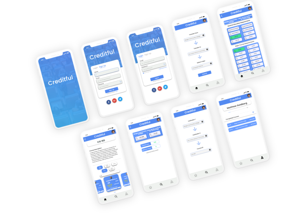
Creditful is an educational recommendation system which simplifies the process of networking, tracking college/pre-college progress, and credit transfer — created for the final project of IS-247: Designing the User Experience at NJIT.
Problem
Pre-college students had no unified way to plan credit transfer, network with peers, and track progress toward their intended major — leading to obsolete information, cluttered tools, and confusion when navigating from community college to a four-year institution.
Process
User personas, storyboarding, claims analysis, problem/activity scenarios, key path scenarios, user flows, sitemaps, competitive analyses, wireframing, hi-fi and lo-fi prototyping, and usability testing.
🔗 Links
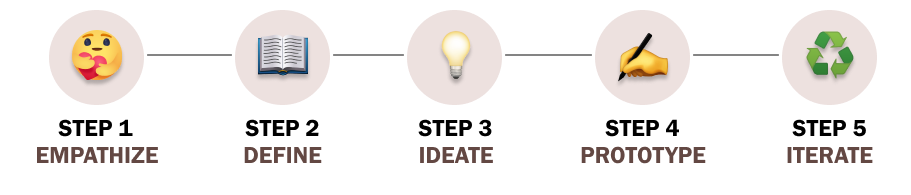
🧭 Overview of Our UX Process
💗 Empathize
Competitive Analysis
To understand the competition in the educational assistance market, I conducted a competitive analysis on two popularly used educational recommendation systems: NJTransfer and RateMyProfessors. NJTransfer is designed to assist students in finding course equivalencies and transfer credits from community colleges to four-year institutions in New Jersey. RateMyProfessors is designed for students to rate their professors on a scale of 1 to 5, leave reviews, and tag professors with flairs like "Easy A" or "Tough Grader."
Although NJTransfer provides helpful information, its presentation can be cluttered and overwhelming. RateMyProfessors has issues with duplicate professors that further confuse users. From my personal experience transferring from Bergen Community College to NJIT, there was a lot of obsolete information on applications like NJTransfer, resulting in me being unable to find my desired courses.
Surveys
Apart from traditional competitive research, I conducted surveys on a sample of 15 high school seniors and 15 community college students to empathize with the frustrations of our desired users. Preconditions for high school seniors were that they were intending to attend a community college upon graduation; for community college students, that they were planning to transfer to a four-year institution.
Key Findings & Results
Students of all academic standings were interested in having a simple and minimalistic presentation of the information. The prototype would require an abundance of information for each user group — such as professor ratings and academic progress monitoring.
🎯 Define
Problem Statement
How might we create a simple and easy-to-use solution for educational recommendations to help students save time and money in their college process?
User Personas
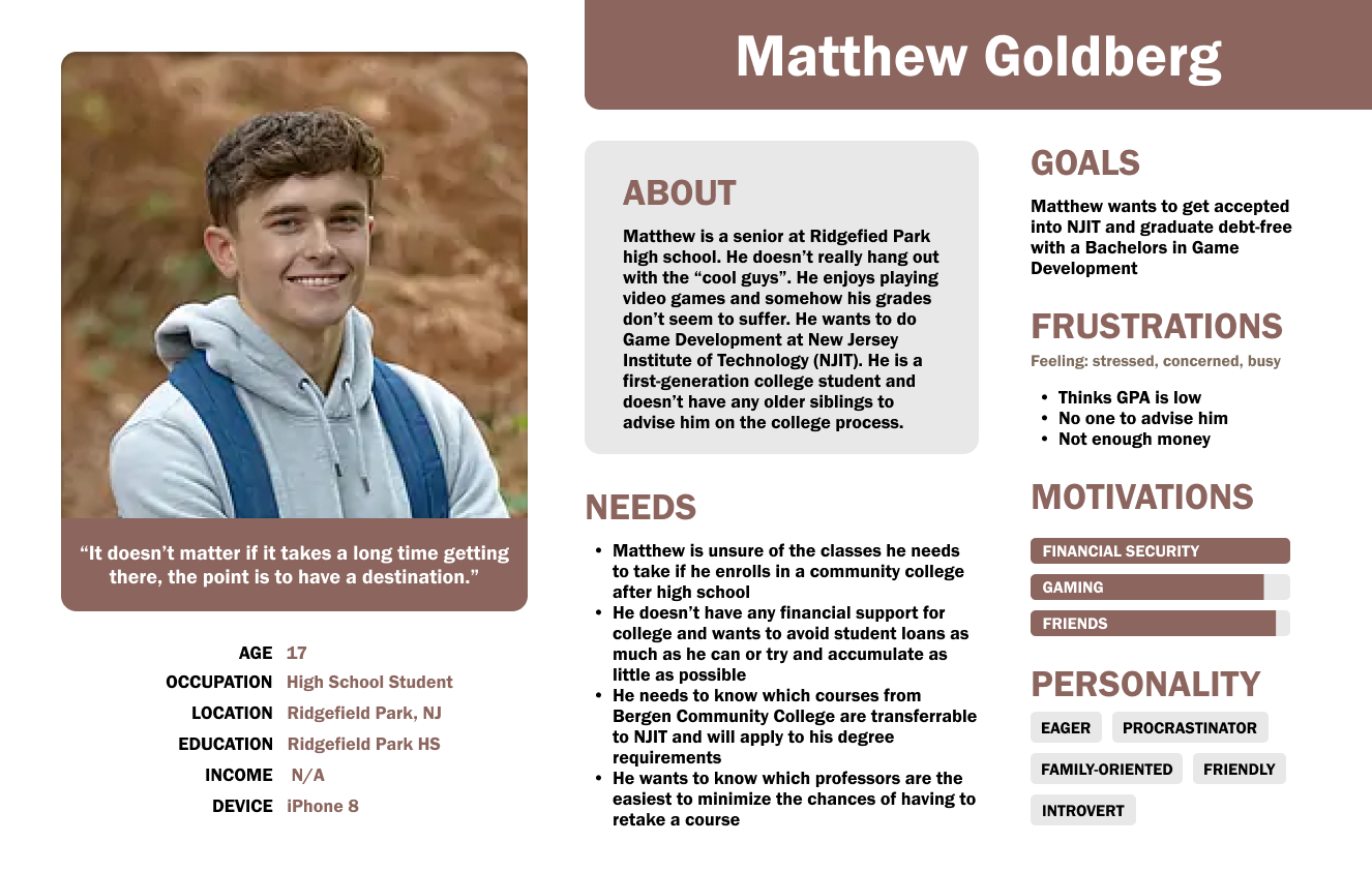
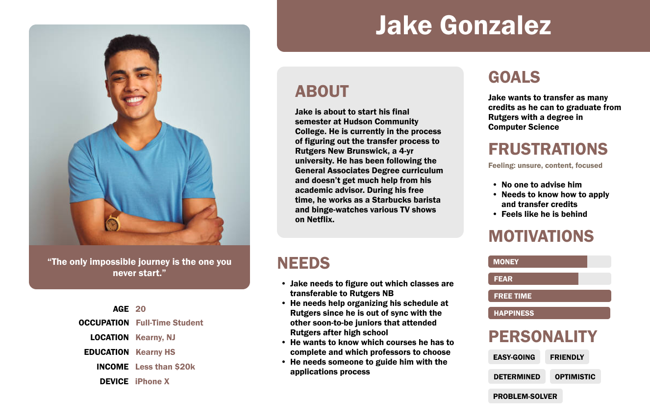
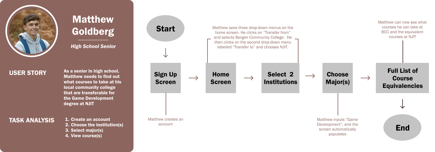
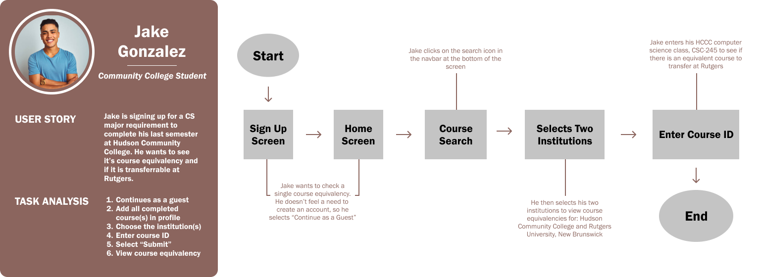
To account for users of varying educational levels, two user personas were created — each representing a targeted audience: high school seniors and community college students looking to transfer to a four-year institution. Each persona highlights the overarching frustration of the lack of academic guidance and advice.
User Flows & Task Analysis
I created a task analysis and user flow for each persona. This gave me a clear picture of the steps the user would need to take to get to their final goal, and how to deliver this goal in the most effective manner possible.
Sitemap
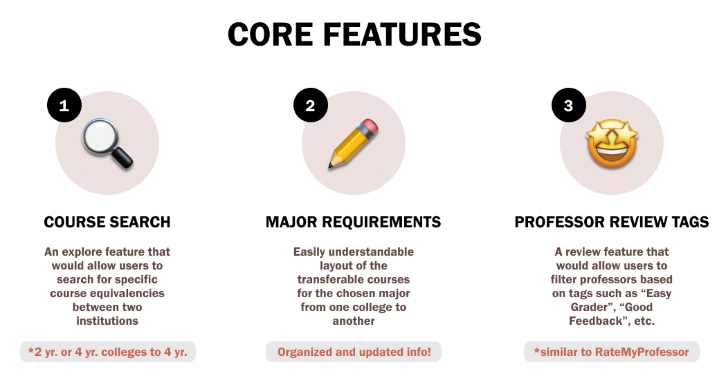
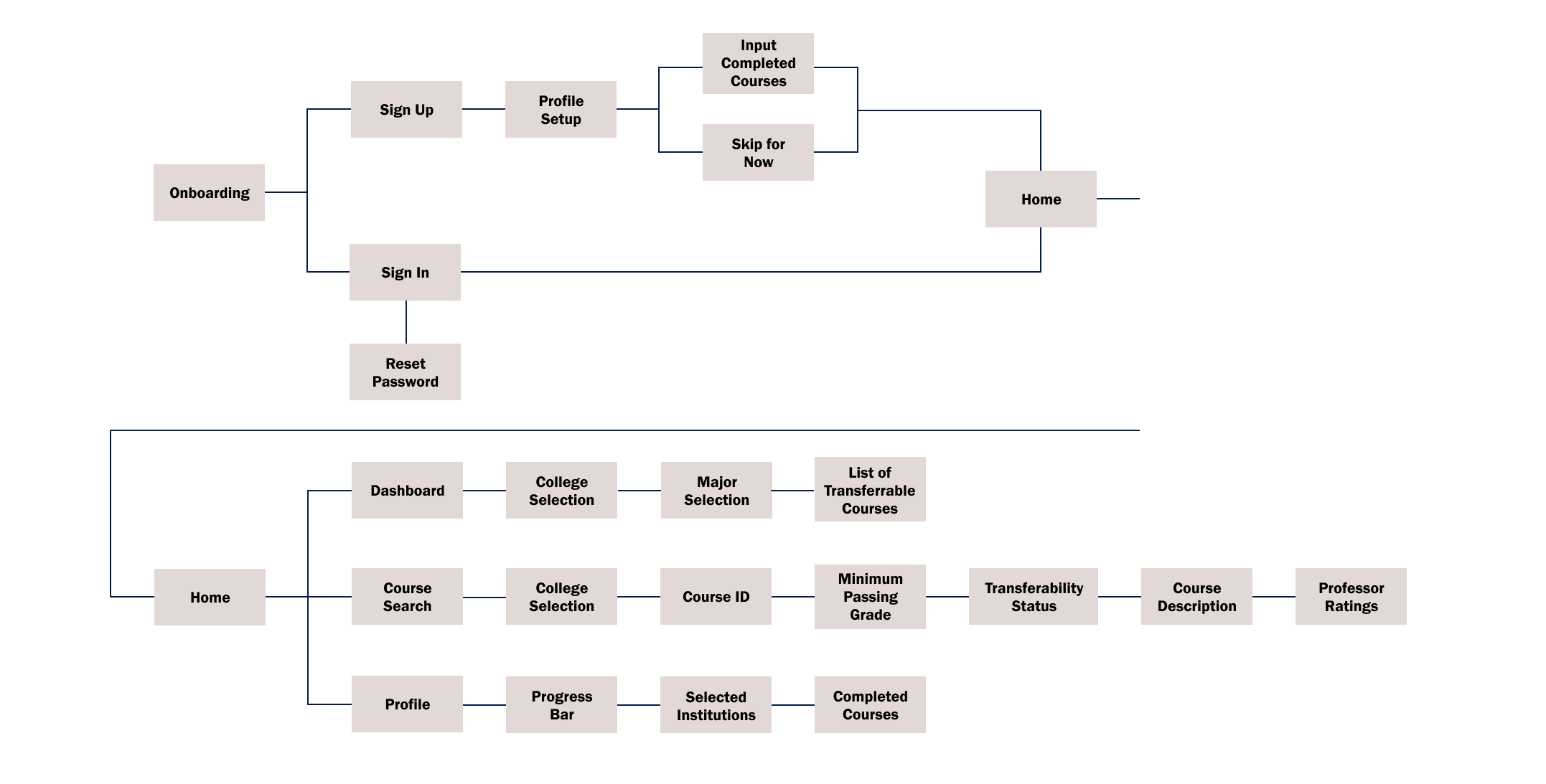
With these core features in mind, I conducted a card sort to see how users might expect the content to be organized and displayed, and used the results to create a sitemap.
💡 Ideate
Goals & Expectations
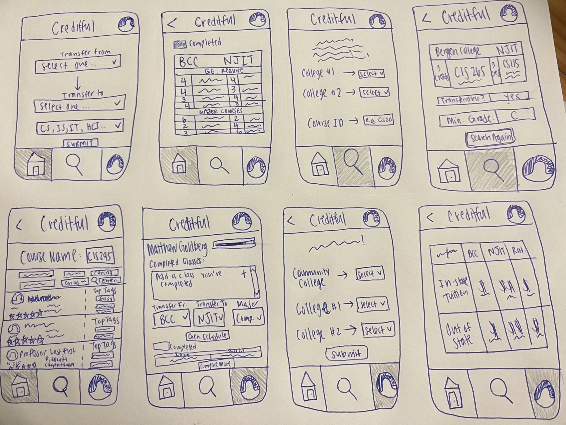
The goal was to make Creditful extremely easy and intuitive — therefore it was essential to keep the number of screens to a minimum. I wanted to highlight the major features that most users would be looking for so that users wouldn't feel overwhelmed by extra and unnecessary information.
I collaborated with my teammates to sketch the wireframes through whiteboarding, further addressing user needs and making Creditful intuitive.
Version One (2020)
📱 Prototype
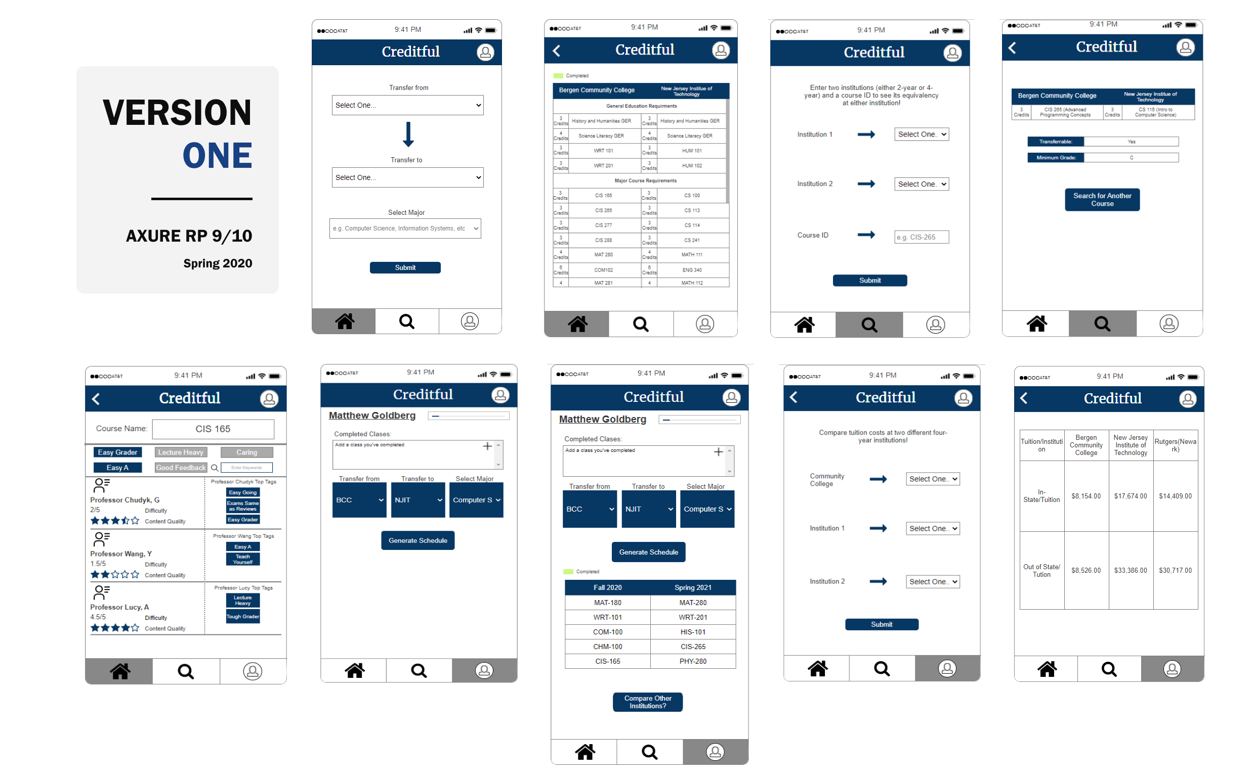
Axure RP 9/10 was used to create mid-fidelity versions of these wireframes back in the Spring of 2020.
Usability Testing
This phase was extremely important because it helped me refine what users found helpful and what they thought were unnecessary. Users were asked to complete scenario-based tasks that would allow them to interact and test the main features of the app.
Positive Feedback
- Users were able to complete tasks quickly.
- Users enjoyed the idea of having professor ratings filtered by tags.
- Navigation proved easy for users to understand.
- Users liked the idea of completed courses stored in the profile — they can fill it out once and compare it to other institutions without re-inputting.
Negative Feedback
- Users were confused by the suggested schedule courses feature.
- Multiple users expressed that tuition cost information is unnecessary and can become inaccurate if not maintained.
- Users found text to be too small.
🔁 Iterate
Design Changes
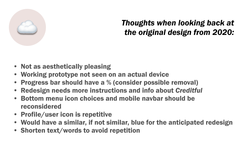
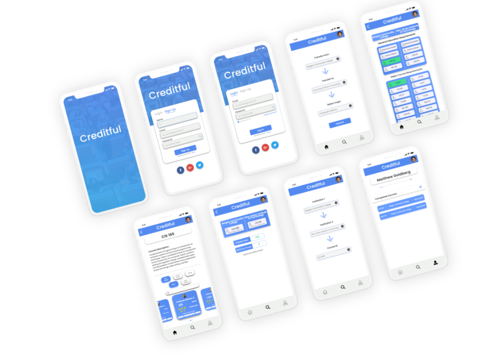
I made changes based on the user feedback and reached out for additional feedback from fellow designers. I created a high-fidelity version of the app that featured more white space and larger icons/text.
🏁 Final Design
Note: This prototype cannot be shared. This is an archived project.
🤝 Contributors
- Jenna Ariza — UI/UX Designer + Researcher
- Justin Agustin — UI/UX Designer + Researcher
- Ibrahim Hamza — UI/UX Designer + Researcher