 Jenna Ariza
City of Midland, TX '24
City Management Dashboard
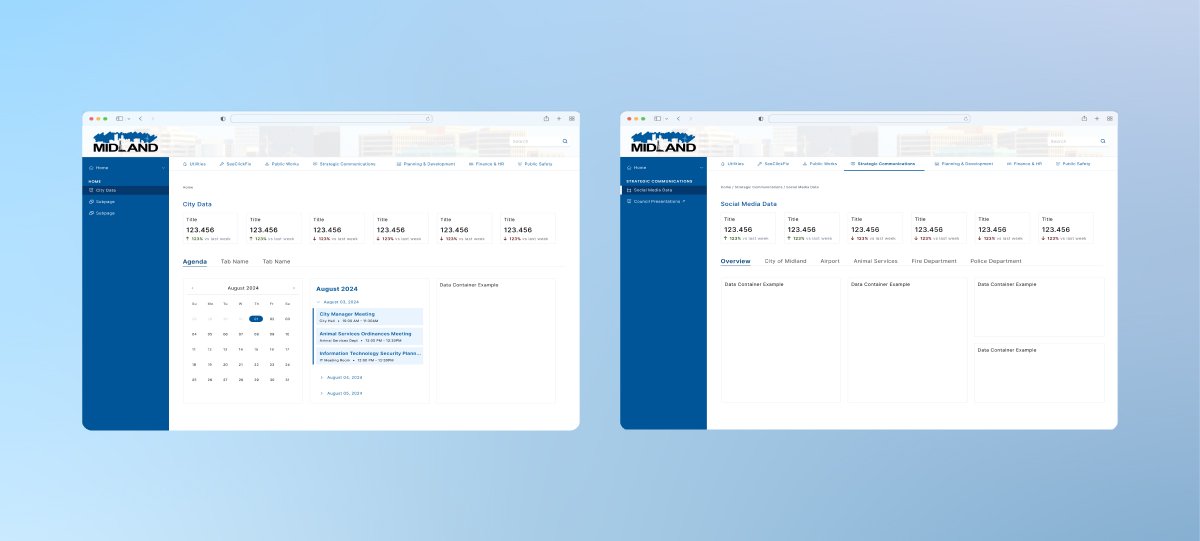
A centralized platform for city officials to monitor metrics, manage service requests, and track departmental performance.
Role
UI/UX Designer
Duration
< 1 Month
Tools
Figma / Figjam / Figma Slides
Overview
This dashboard gives city officials a centralized platform to monitor key metrics, manage service requests, and track departmental performance. It streamlines operations with tools for financial tracking, public safety, and community engagement, improving decision-making and efficiency.
Problem
City officials struggled to efficiently manage and respond to the growing volume of service requests and track real-time departmental performance, leading to delays in decision-making and reduced operational efficiency.
Process
Reviewed the current dashboard with stakeholders, mapped the existing sitemap, ideated three navigation approaches (side, top, hybrid), and presented benefits via Figma Slides before finalizing the hybrid direction for Phase I.
Outcome
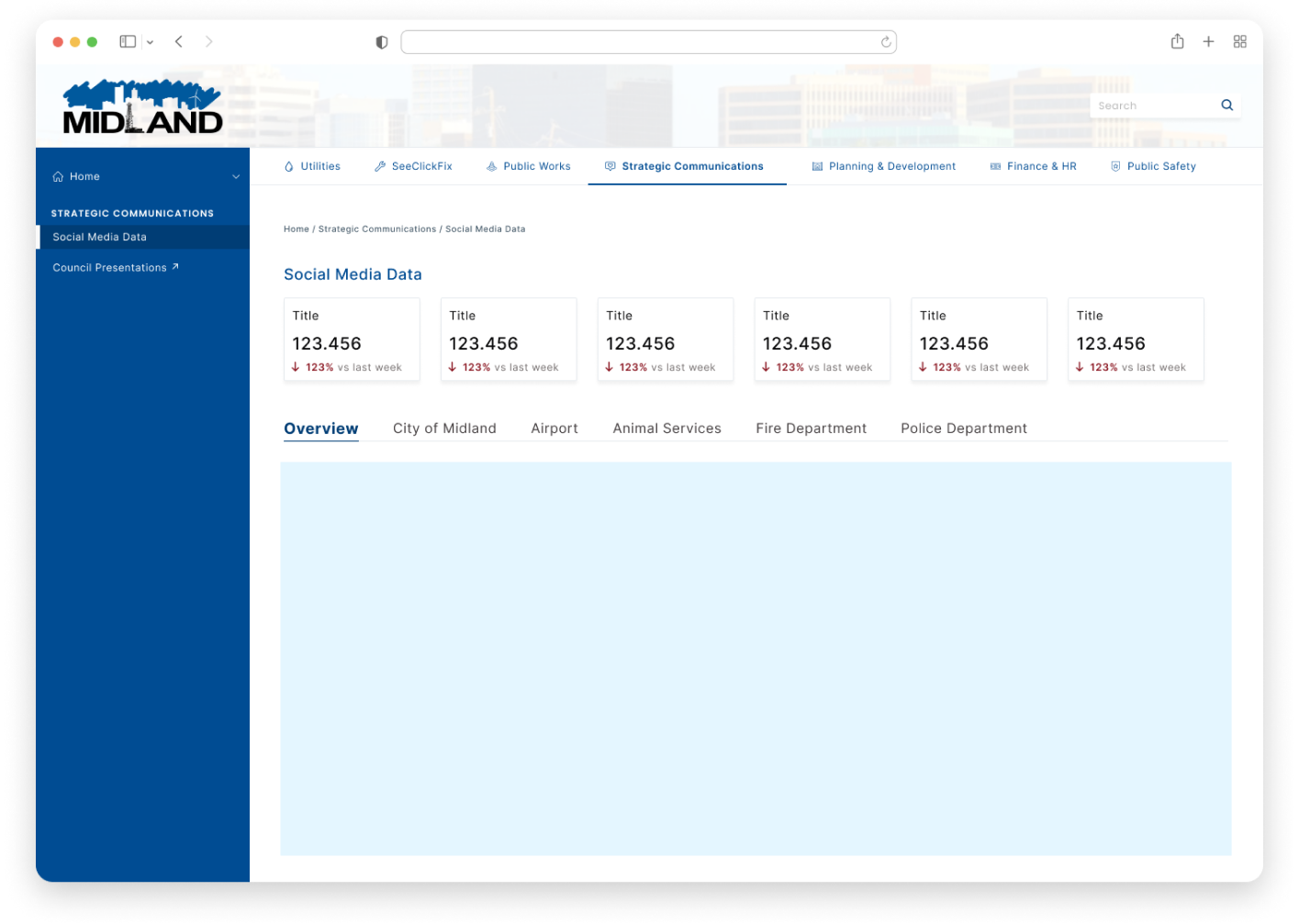
A cohesive Phase I hybrid-nav dashboard that unified service request management, KPI tracking, and cross-department visibility into a single accessible workspace — with a full handoff document guiding development and future phases.
📝 Handoff Document
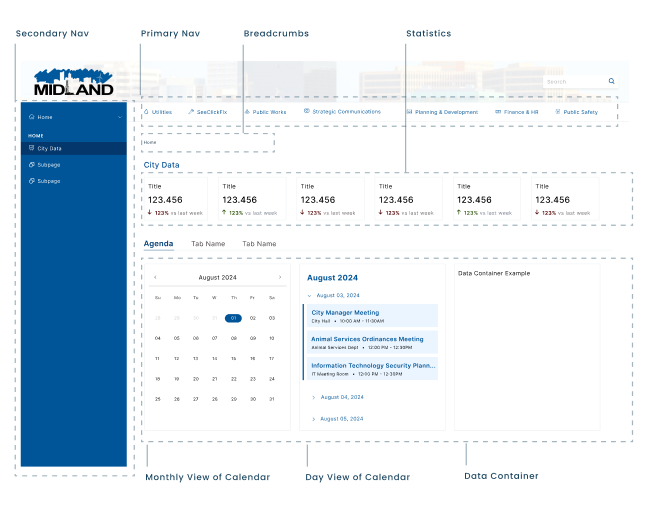
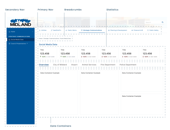
The third option, the hybrid design, was selected as the chosen approach. As noted earlier, this design represents only phase one of many future iterations. However, due to time constraints, we prioritized key elements to ensure a timely launch. After the UX team and I made final adjustments to the initial version of the dashboard, we created a handoff document for the development team. This document provided clear instructions for reviewing and implementing changes, particularly for the empty cards or boxes where future data would be displayed.
The handoff document included an overview of the homepage and subpages, detailing key elements and specifications such as card layouts and container styles. Once accepted, our UX analyst played a crucial role in resolving any data gaps, ensuring seamless integration with Power BI and other tools, as well as supporting development processes involving HTML/CSS.
👤 Stakeholder Review
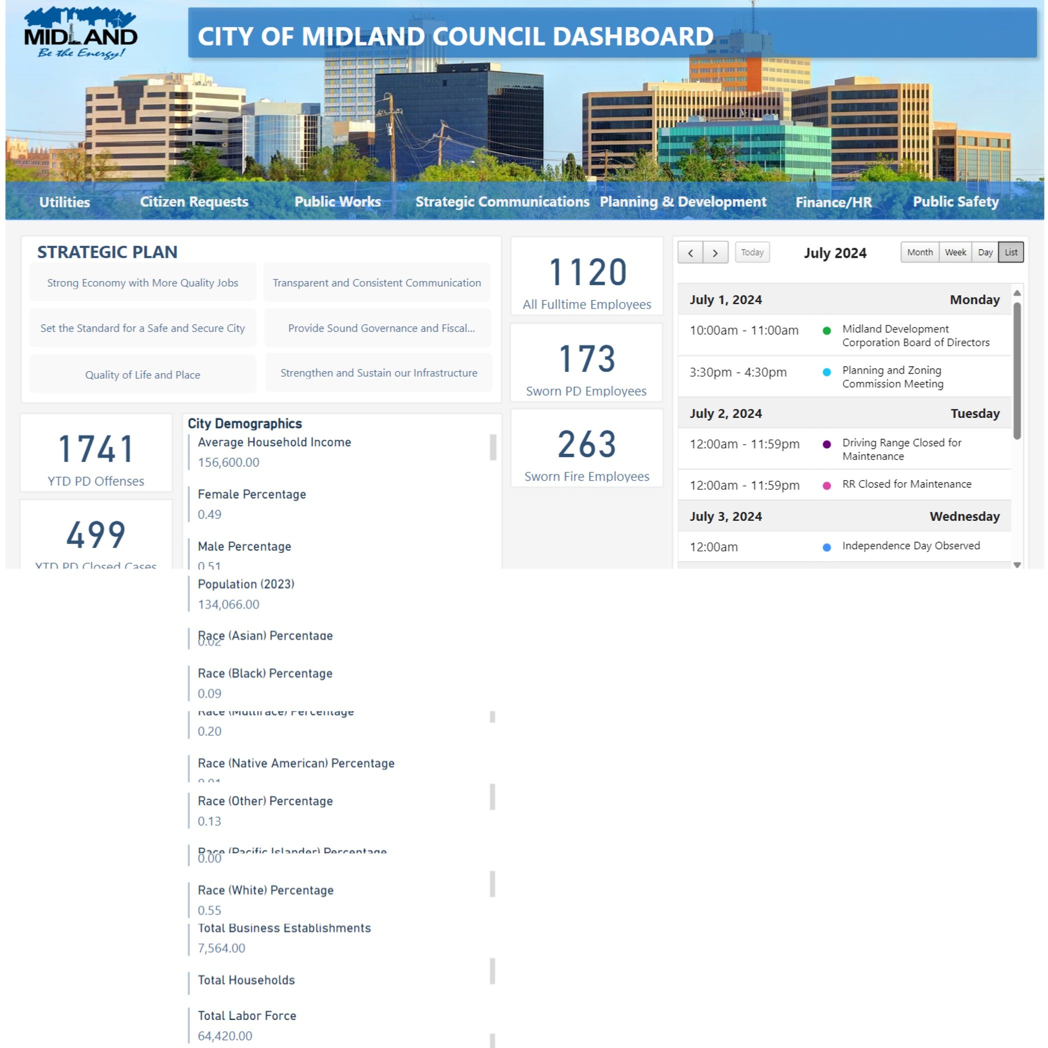
The UX team met with stakeholders to review the existing dashboard and identify key improvements. Initially, the team was informed that the dashboard needed to be revamped and was provided with limited background information, including a link to the current dashboard used internally by Midland city employees. Stakeholders briefly emphasized the need for "better organization, clearer information presentation, and overall design enhancements to make the dashboard more intuitive." Midland aimed to launch the updated dashboard within 2–3 weeks.
Given the time constraints, the UX team clarified that the project would be released in phases, with the first phase designed to have a functional dashboard online as quickly as possible. After the meeting, the UX team compiled a list of questions for the next scheduled meeting to gather further clarification before proceeding with the redesign process.
Meeting Notes
- ✍🏼 Viewability: "would like to display to council members."
- ✍🏼 Mihir P (Software Systems Manager): "The goal is to reduce the 5 am calls." · "Based on information, then categories started to build based on the information needed."
- ✍🏼 Alberto F. (Programmer/Analyst II): "[We need] visual changes." · "All stats are going to be gone." · "Just keep calendar and strategic comms page (financial budget)." · "Main statistics for everything → giving people a source of information."
Page Specifications
- 🗒️ Dashboard Home View: "Keep on the main page only"; "picture below the navigation menu."
- 🗒️ Statistics: "Really important page as it holds every piece of information within the city."
- 🗒️ FAQs: questions asked by the public; "statistics of those questions"; e.g., average fireman salary.
- 🗒️ Crimes: "Types of criminal offenses, total amount, closed/resolved cases."
- 🗒️ Strategic Plan: "Links to open gov financial charts."
🗺️ Existing Sitemap Review
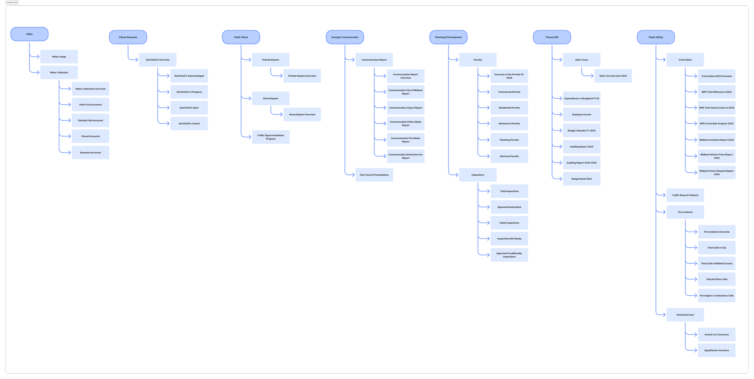
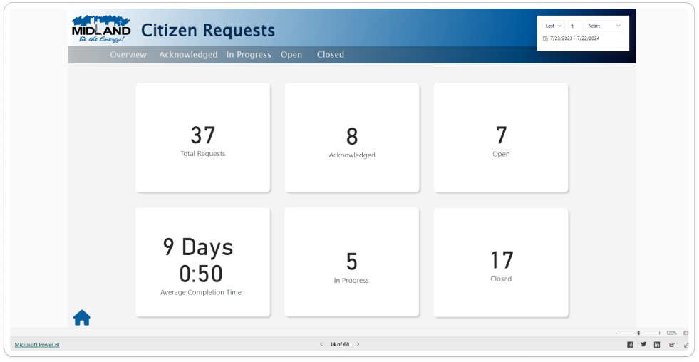
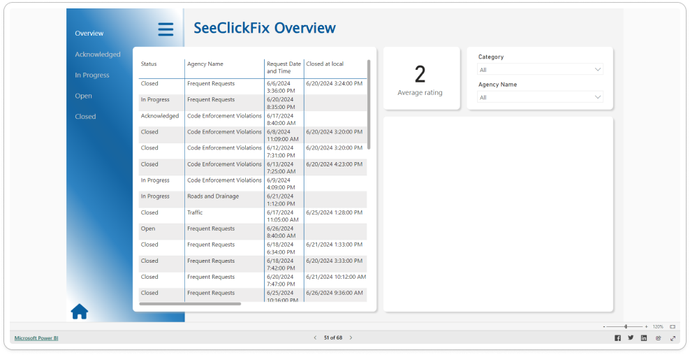
Drawing on our knowledge of the current city management dashboard, my team and I set out to create a sitemap of the existing user interface. This effort aimed to enhance our understanding of the visual hierarchy between the pages and identify areas for improvement. By mapping the user interface, we hoped to pinpoint any usability issues and ensure a more intuitive navigation experience for users in the redesigned dashboard.
🪜 Planning
After scheduling another meeting, the UX team presented their previously noted questions and posed additional follow-up questions to gain a clearer understanding of the dashboard's requirements. My team shifted our focus to identifying what the dashboard needs to accomplish, what functions it should provide, and how it can best serve users — whether those features are currently available or not.
- Dashboard Usage: What important information needs to be at the forefront? What is the ultimate goal for the dashboard?
- Is the "Strategic Plan" section more so finance?
- Is there a better way to showcase the "City Demographics" (e.g., pie chart)?
- Employees: Do Fire and PD count in with the 1,120 total employees? What about contract/interns? How is this data used by city officials?
- Calendar: Is this for all internal leadership events for the city?
- [UX] What could we utilize from Power BI for the new UI? (Cards, navigation, charts, line, bar, pie.)
⚠️ Requirements
We also ensured that the variations would incorporate the following elements based on our research:
- Home — Strategic Plan (external links), Calendar.
- Statistics Page — FAQs & Data, stats in dashboard.
After extensive review and discussions, our team began the ideation process. We decided to present Midland with a variety of design options based on the following variations:
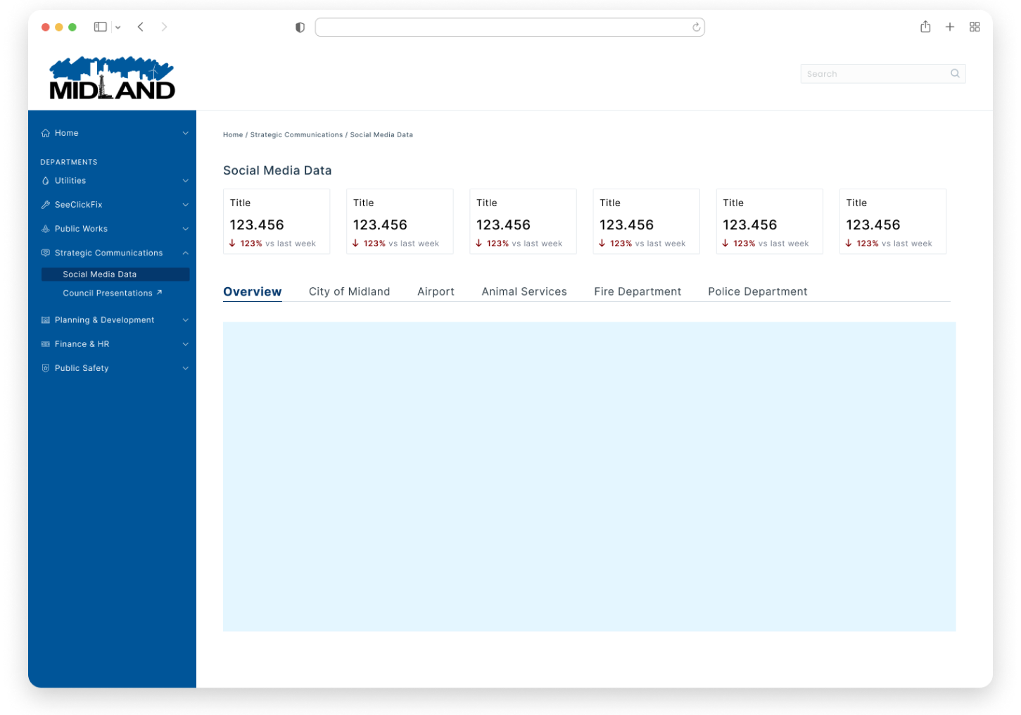
- Side Navigation: a vertical menu that provides quick access to key features while maximizing content space.
- Top Navigation: a horizontal menu that allows for a clean and streamlined interface, ideal for a compact view.
- Combination of Both: a hybrid approach that leverages the strengths of both side and top navigation, providing flexibility and accessibility for users.
By offering these options, our aim was to build prototypes that would ensure the dashboard would meet the diverse needs of city employees while enhancing overall usability.
🔍 Competitive Research
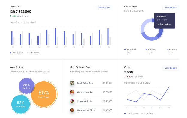
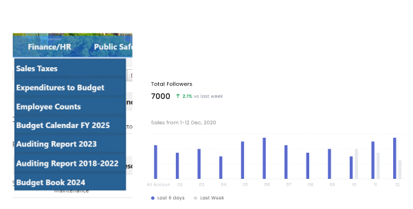
Our team reviewed various examples of website-based dashboards to gain inspiration for layout design. During our decision-making process, we identified one dashboard in particular that closely aligned with our needs and the data we intended to include, using it as a primary source of inspiration for our design.
Goal
To enhance the dashboard's capabilities by improving real-time data visualization and optimizing task prioritization features, ensuring city officials can manage service requests more effectively and make timely, informed decisions.
🖥️ Presentation
Due to a recent update from Figma that introduced "Figma Slides," we decided to utilize this feature to showcase our work in a more organized manner. The slides included an agenda, the dashboard's goals, the current sitemap, an overview of the three navigation options, and a rundown of the benefits for choosing each option. The presentation concluded with a Q&A session to address any questions or concerns.
Side Nav View
- Navigation: side navigation supports the growth of different categories and departments; it shows users which tab and location they are currently in.
- Data & Content: all data and statistics live on the right side of the dashboard.
Top Nav View
- Navigation: top navigation allows for visibility, accessibility, familiarity, and a constant point of reference.
- Data & Content: all data and statistics live below the navigation bar, allowing information to flow seamlessly.
Hybrid Nav View
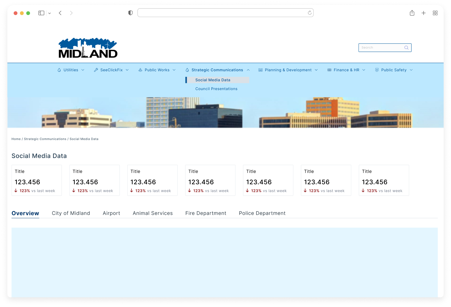
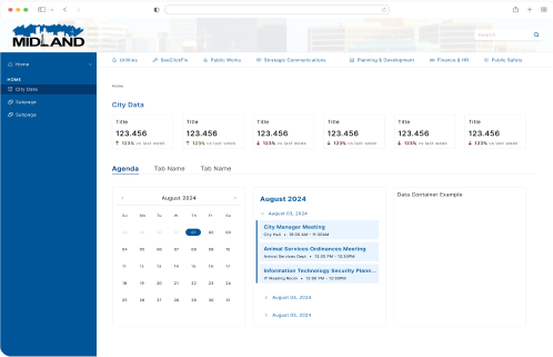
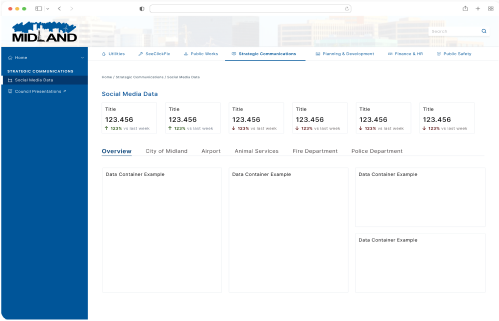
- Navigation: improved usability/consistency, enhanced organization/accessibility, reduced clutter, focused content delivery. Maintains similarities to the old dashboard so users can easily familiarize themselves.
- Data & Content: accommodates new pages, easy to maintain.
- Overall layout: professional, visually appealing, clean feel, enhanced discoverability.
📱 Final Design of Phase I
🔮 Future Enhancements
If I could go back in time to enhance the user experience of the City Management Dashboard, I would consider the following improvements:
- Advocate for a more flexible deadline to allow adequate time for development.
- Conduct user testing with internal employees currently using the dashboard.
- Implement a survey to gather feedback on improvements needed after phases.
- Push for a broader color palette to enhance the branding's visual impact.
- Ensure the product we design aligns precisely with the specifications provided to the development team for implementation.