 Jenna Ariza
City of Midland, TX '24
Design System & Branding
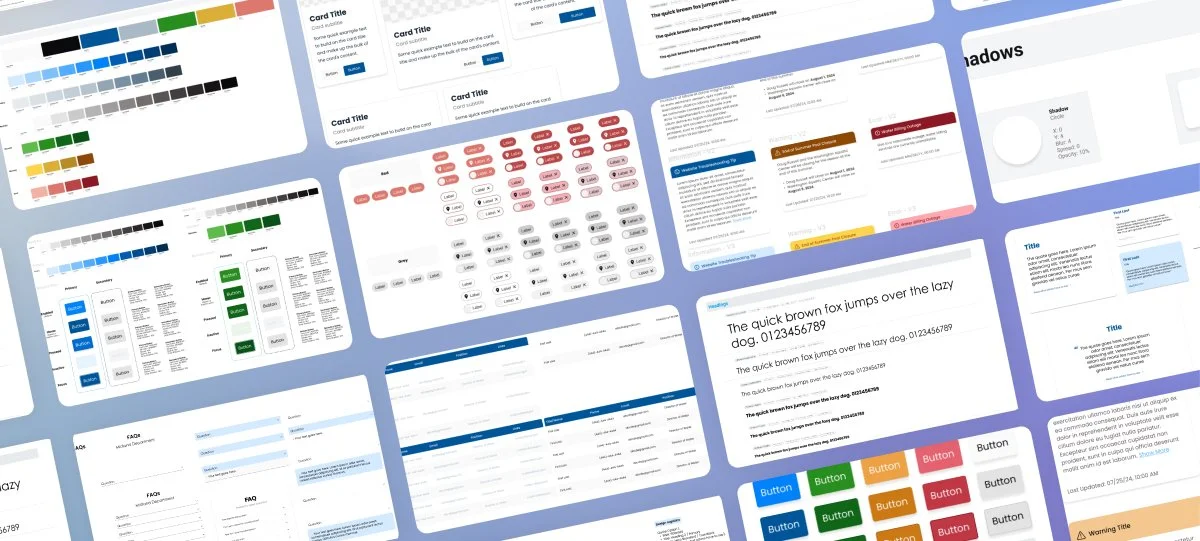
A cohesive design system that defines visual guidelines, typography, color, and iconography for consistent city interfaces.
Role
UI Designer
Duration
6 – 8 Weeks
Tools
Figma / Figjam / Figma Slides
Overview
A cohesive design system and branding elements to enhance Midland's digital presence. This project involved defining visual guidelines, typography, color schemes, and iconography that reflected Midland's identity while ensuring consistency across all user interfaces.
Problem
The City of Midland's digital platforms previously exhibited a fragmented visual identity, with inconsistencies in design elements such as color schemes, typography, and logo usage across various services and interfaces. This lack of uniformity made it challenging for users to recognize and engage with the city's online presence cohesively.
Process
Ran a competitive analysis of four government and established-brand sites, audited existing Civic Engage colors/fonts, and codified reusable tokens, components (buttons, cards, tags, info tips, tables, FAQs, quotes), and iconography into a Figma library.
Outcome
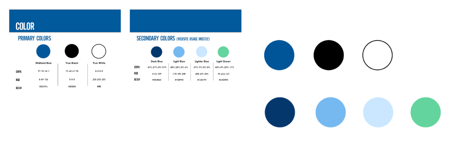
A revised brand guidelines document defining primary/secondary fonts, logo sizing, and primary/secondary color specifications (CMYK, RGB, Hex) — plus a Figma design system that will inform future improvements to Midland's digital presence.
🥅 Goals for Competitive Analysis
Thought Process
- Analyze four (4) government business models.
- What are the key features/takeaways and user experience of our competitors?
- What did they do bad/good?
- Competitors vs. our current website.
- Primary, secondary, tertiary.
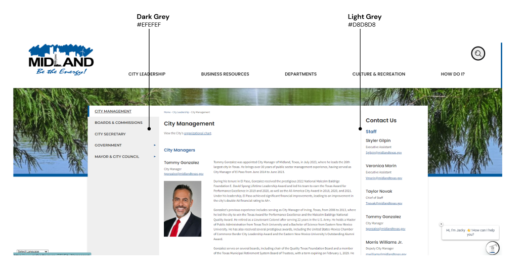
🚩 Issues Perceived within Midland, TX Site
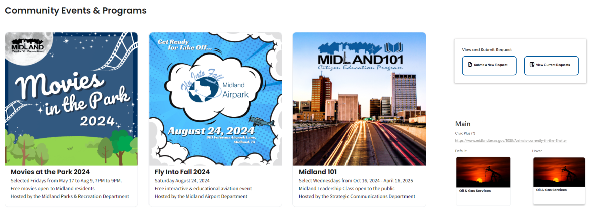
The website displayed several inconsistencies across its pages that significantly hindered user experience. Layout variations and inconsistent color coding made it challenging for users to navigate the site effectively. Furthermore, the iconography lacked a cohesive style, which complicated the quick interpretation of information and disrupted the overall flow.
These design issues resulted in a less readable interface, complicating user navigation and leading to confusion. The absence of clear sectioning in the format further exacerbated this problem, while poor contrast diminished both readability and accessibility. To enhance usability, it is essential to establish a consistent design approach that prioritizes clarity and coherence.

🌐 Local Governments
El Paso, TX
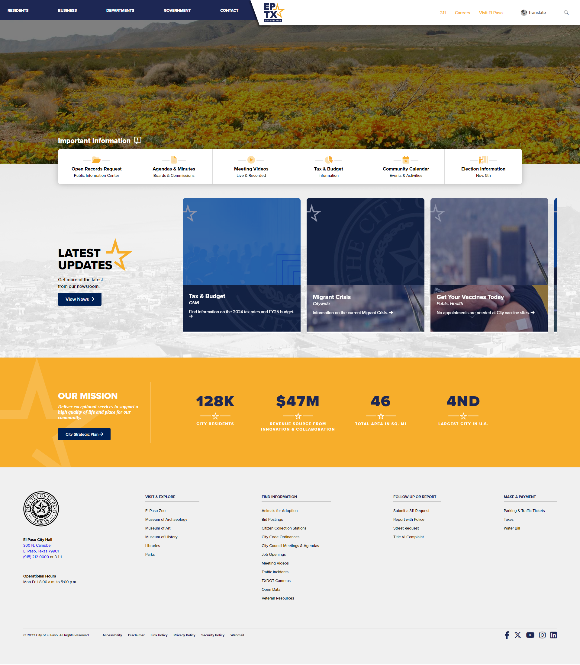
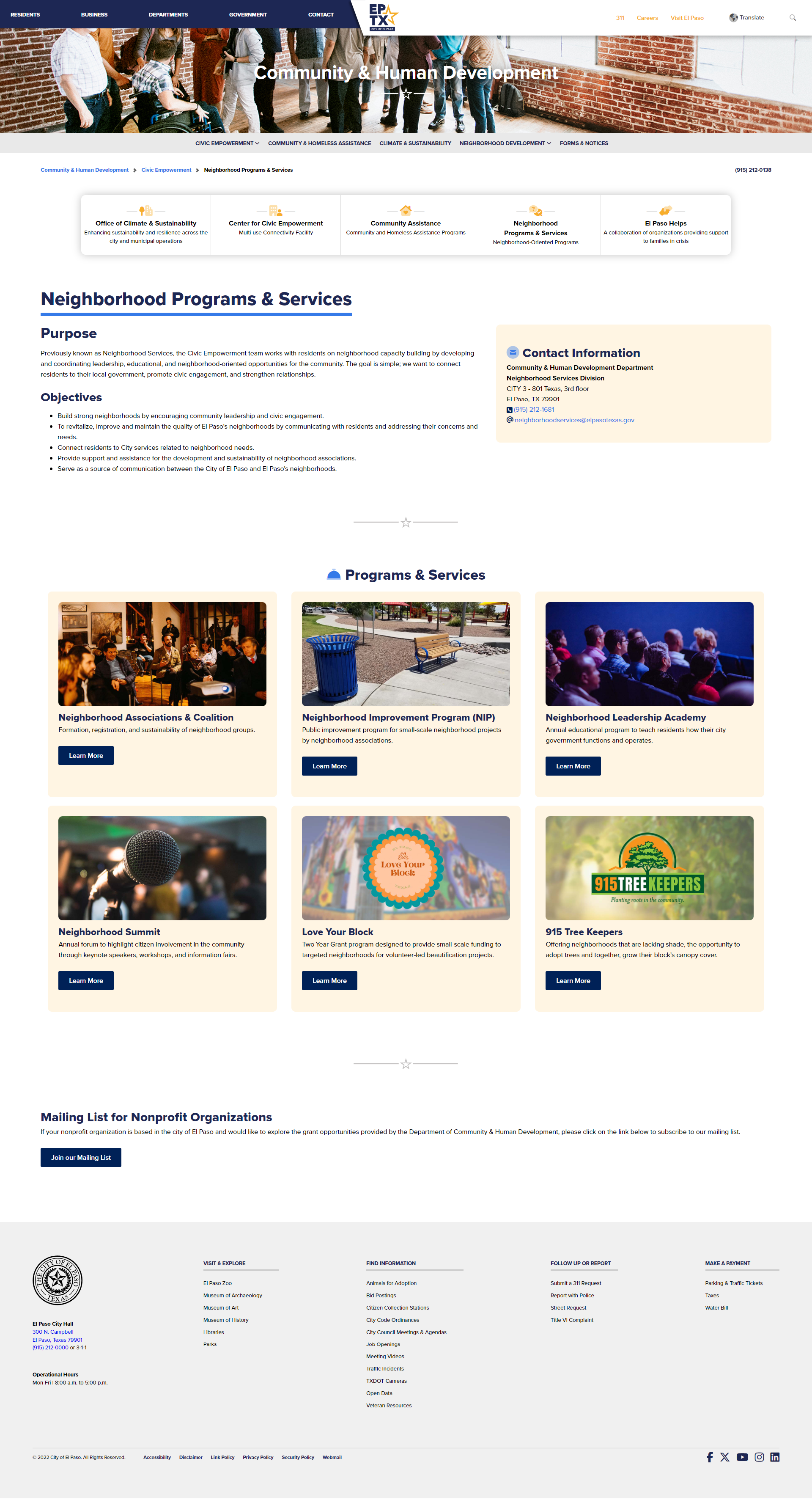
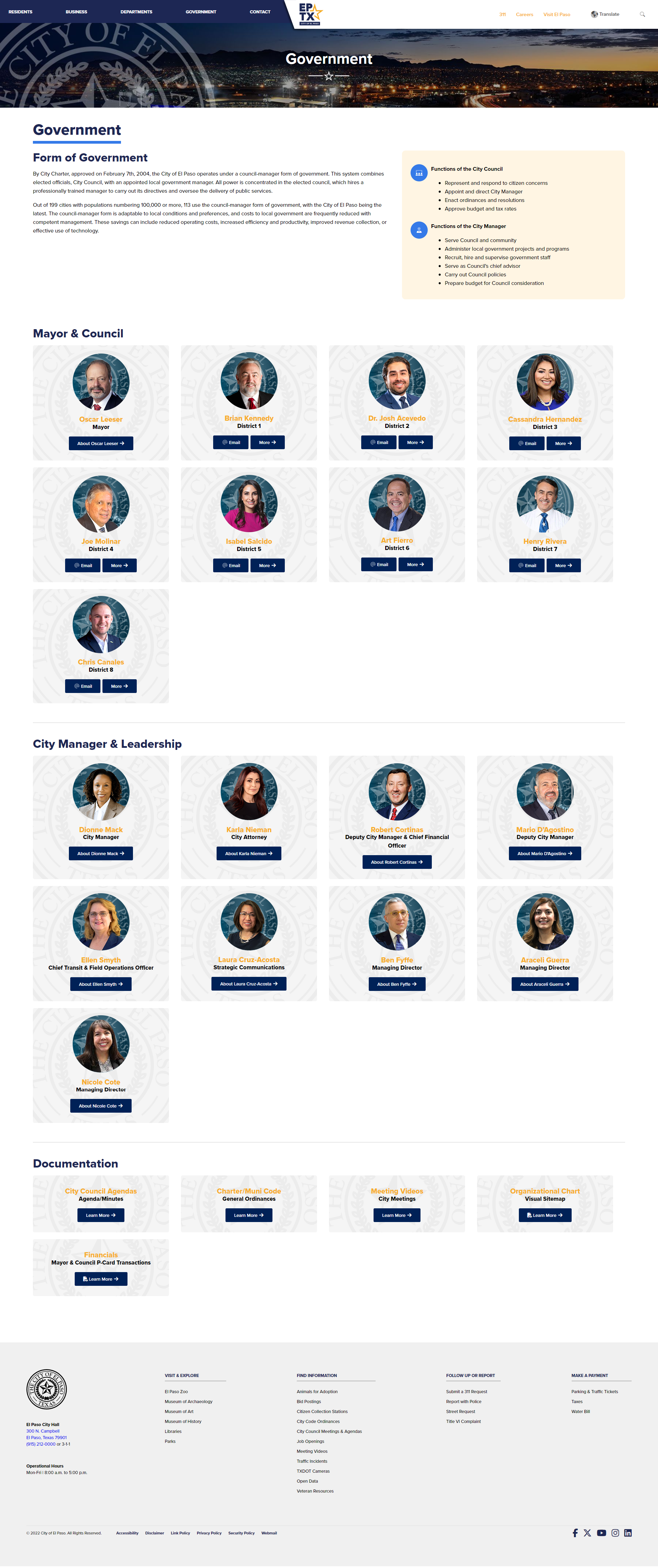
- Primary Color — Dark Blue: main headers, navigation, footer background, and buttons.
- Secondary Color — White: page backgrounds, body text, secondary headers.
- Accent Color — Orange/Yellow: call-to-action buttons, links, notifications.
- Contrast: white background with dark blue text; dark blue background with white text.
Austin, TX
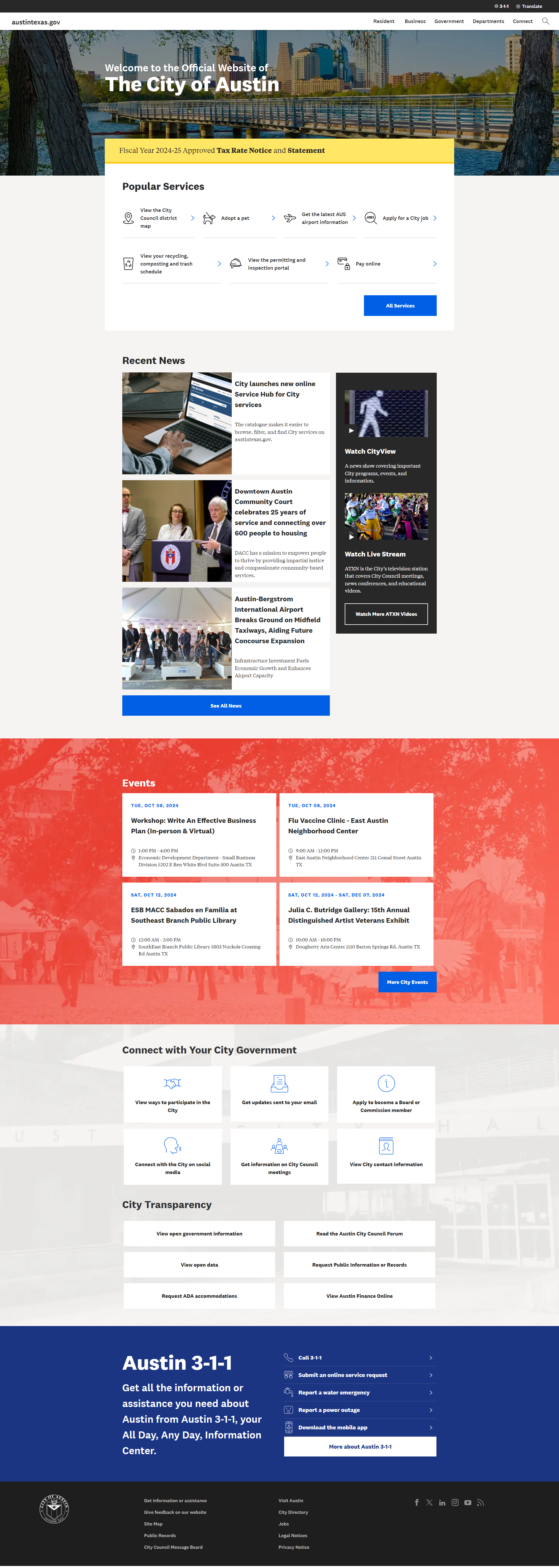
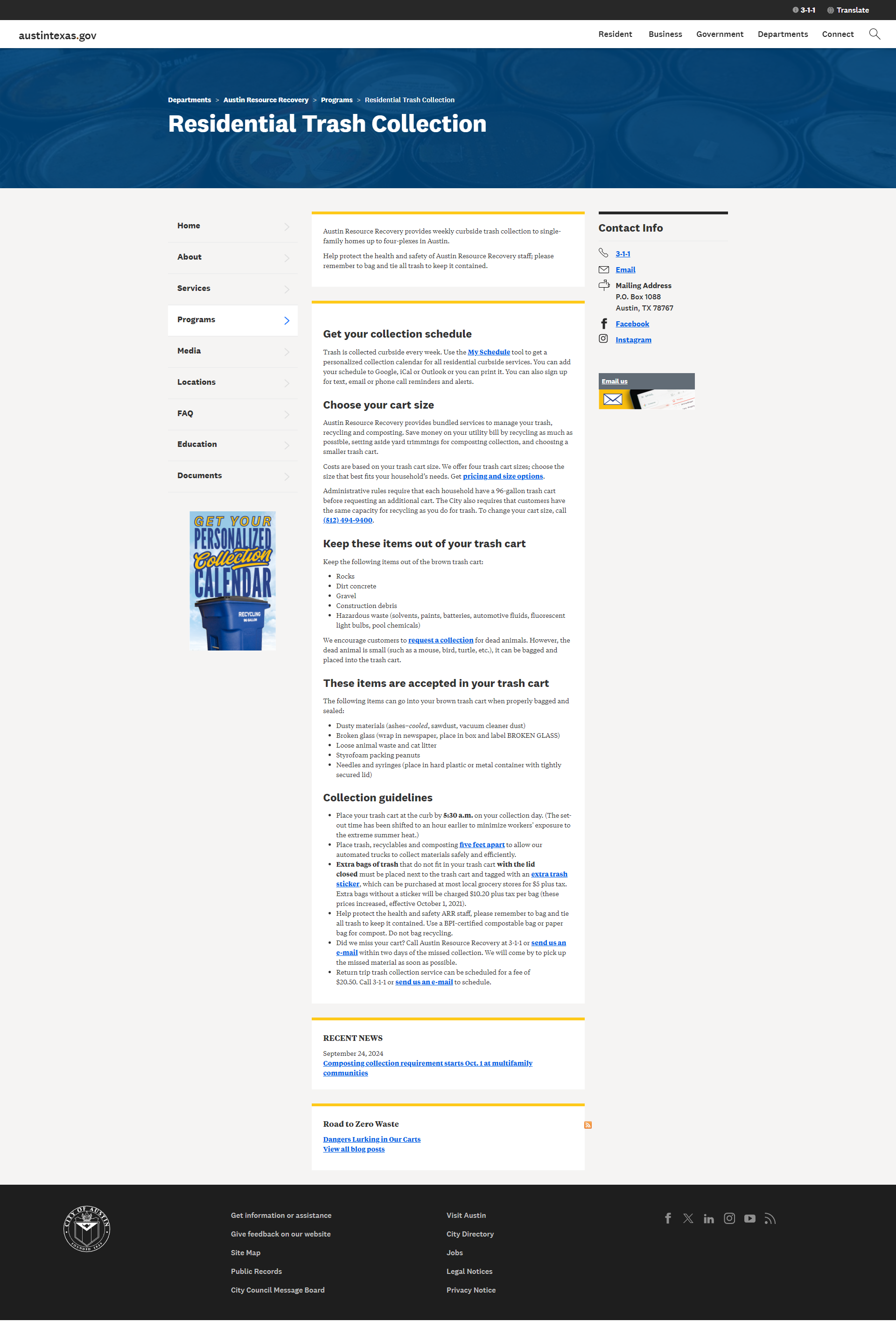
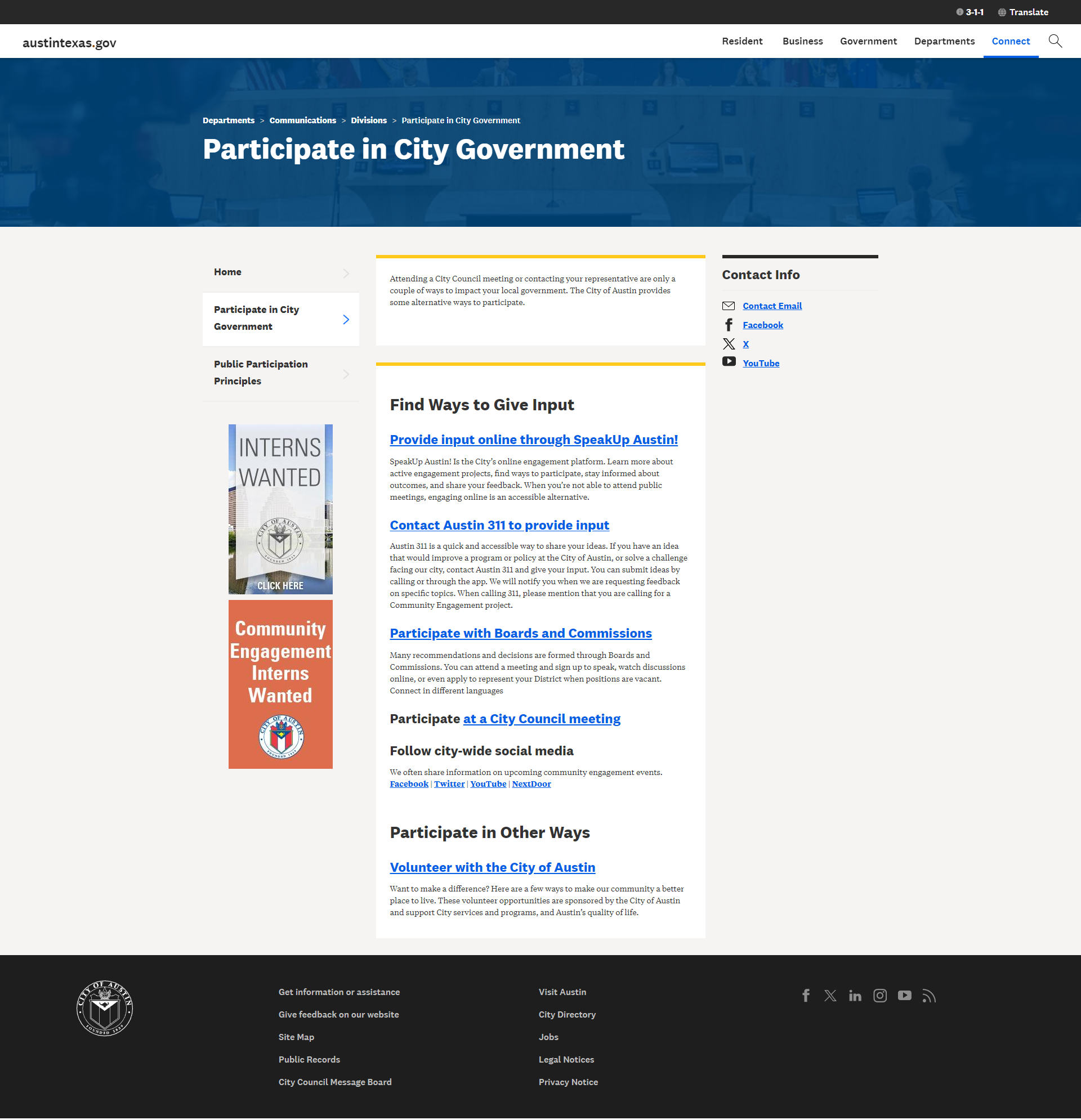
- Primary — Blue (headers, links, CTAs) and White (backgrounds).
- Secondary — Gray (secondary info, backgrounds, borders).
- Accent — Green (environmental highlights) and Yellow (box-top backgrounds).
- Contrast combinations: white bg + dark blue text; dark blue bg + white text; gray bg + black text.
Key Takeaways
- A uniform layout across all pages to enhance user experience and create a cohesive visual identity.
- Content is broken into clearly defined sections, using dividers or logo icons to guide users and improve navigation.
- Quick actions are made readily available, alongside information retrieval to enhance usability.
- All information, photos, and other content are current and relevant, fostering user trust and engagement.
- Effective layout dividing the page into left (subpages), middle (information), right (contact info).
🌐 Established Organizations
World Wildlife Fund
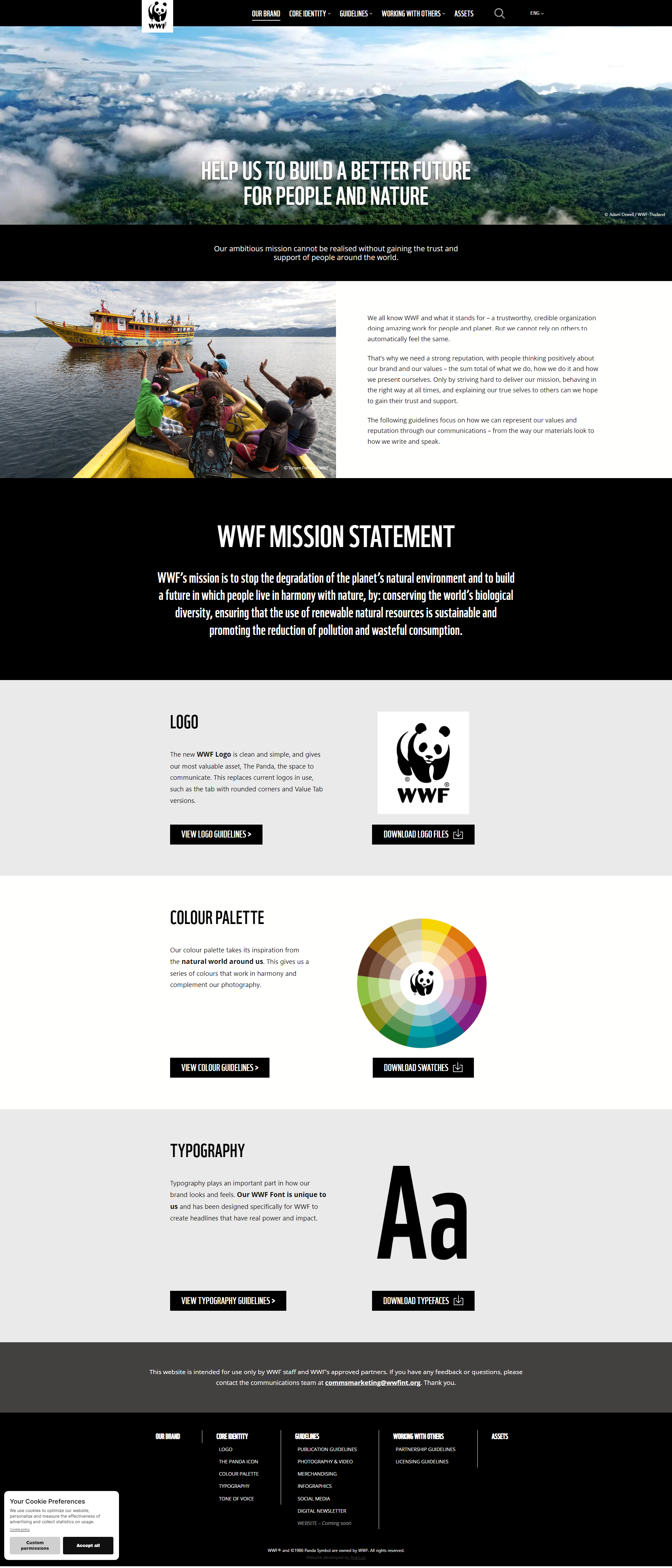
- Palette effectively communicates the brand's mission and values without relying on complex color relationships.
- Minimalist use of black and white ensures readability and accessibility; green accent reinforces CTAs.
- High contrast facilitates easy reading; low-contrast elements create a clear visual hierarchy.
- Emotional/psychological impact: black = authority; white = purity/cleanliness; green = nature/sustainability.
Nike
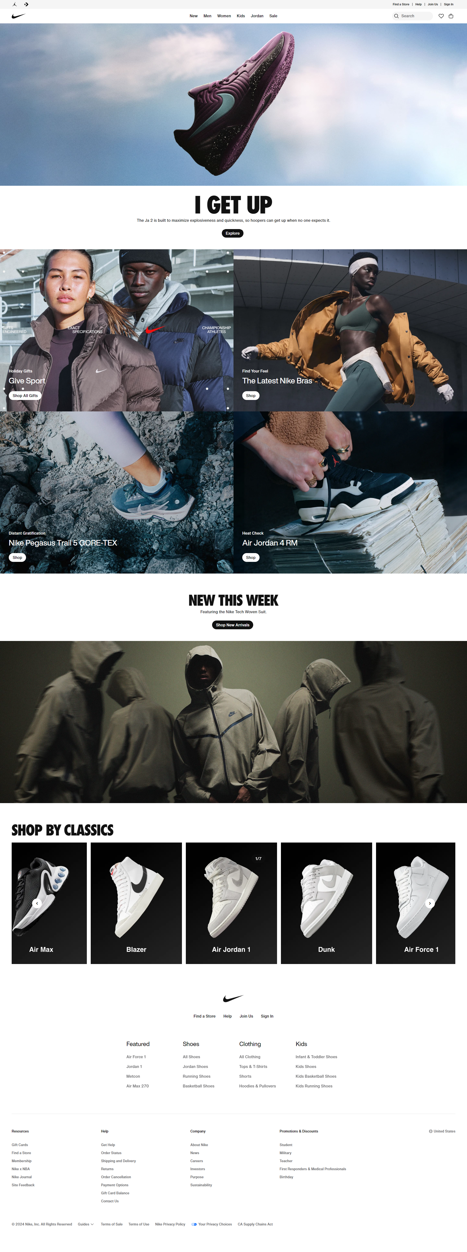
- Monochromatic color scheme & brand recall — bold, minimalist color palette.
- High contrast for readability; black background with white text for special sections; consistent branding.
- Effective use of space: white space prevents visual clutter; visual hierarchy draws attention to key elements.
- Responsive, adaptive color use; engaging visuals with dynamic layouts.
📝 Color Review and Enhancement
Before moving forward, it was essential to review the color palette utilized by the city's website builder, Civic Engage. The initial branding imposed a limited color scheme that needed to be assessed for potential improvements. To create a visually appealing website that aligns with the new branding, we aimed to update the color selections to reflect current design trends and enhance the overall user experience.
Existing Branding
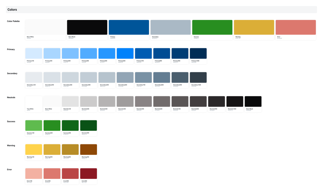
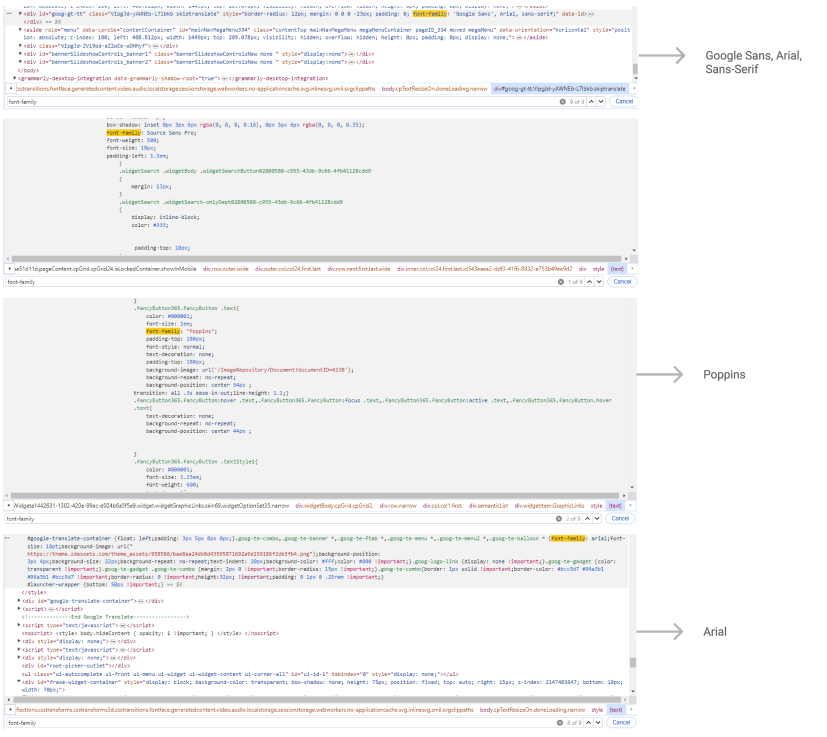
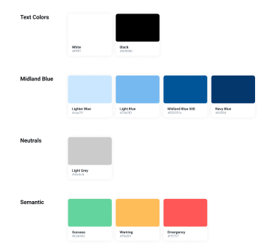
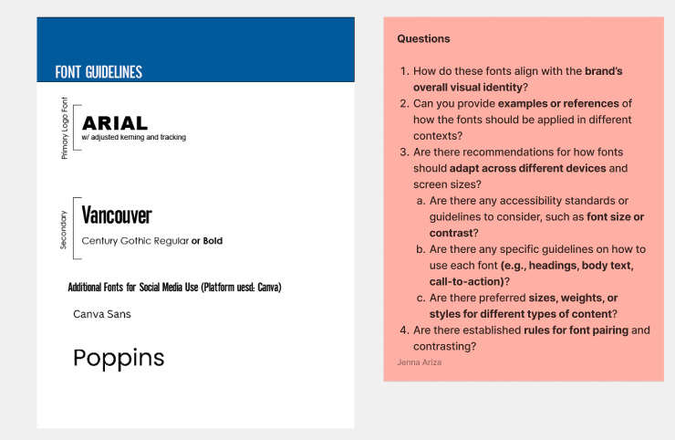
View Midland's Brand Guidelines Document ↗Although a branding guide was already in place, it lacked essential elements and clear specifications typically found in a comprehensive identity guide, such as defined color schemes and other key details. Due to these shortcomings, it was evident that the entire branding guidelines needed to be restructured. Below are some snippets from the revised document:
❖ Proposed Components
In this project, I took the lead in developing essential components for our website, collaborating closely with the UX team to propose solutions to upper management. We held regular group meetings to brainstorm and identify the components needed for the website, ensuring that all perspectives were considered. To facilitate a smooth handoff and maintain consistency, we utilized Notion's platform to document our discussions and write code snippets.
Colors
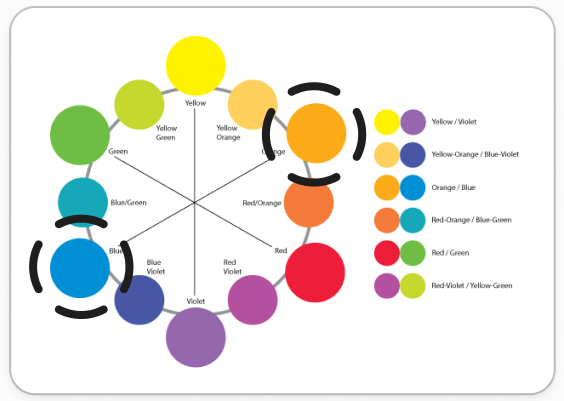
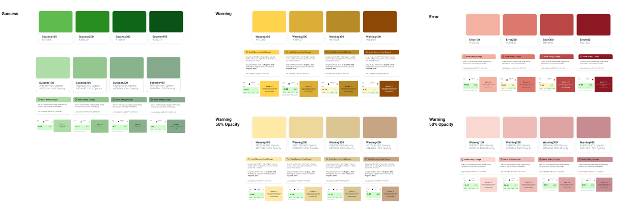
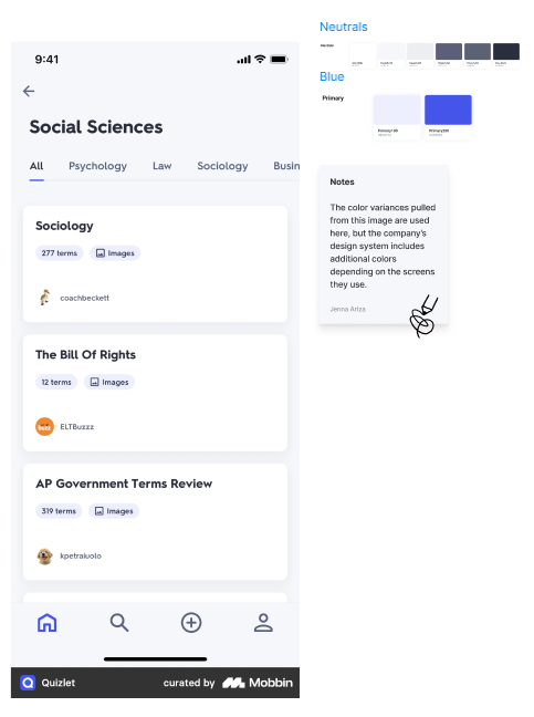
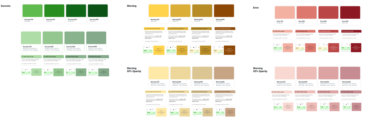
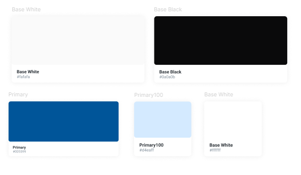
The color palette was created by building upon the existing brand colors, as outlined in the branding guide. I reworked the colors to ensure they adhered to UX best practices, including ADA compliance, for improved accessibility and user experience.
Fonts
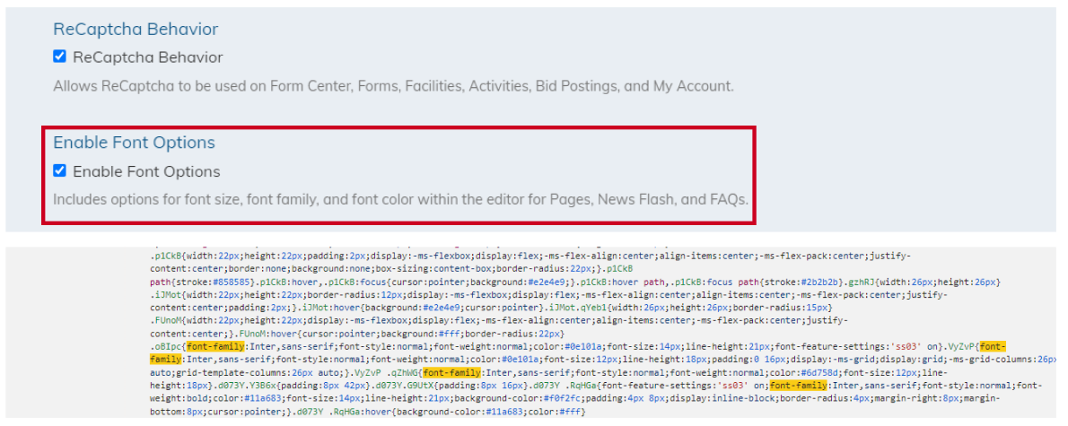
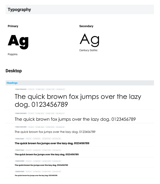
As part of the project, I conducted a comprehensive review of the approved fonts from the branding guidelines and compared them against the existing fonts used across the Civic platform. My goal was to identify any inconsistencies with the brand and suggest improvements for Primary, Secondary, Desktop, and Mobile typography — analyzing font size, weight, line height, and letter spacing across headings and body text.
Shadows
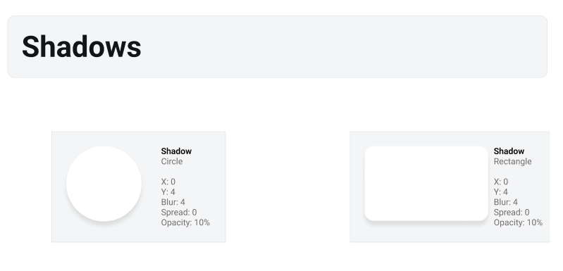
During our evaluation, the team identified that the website lacked any shadowing, which could affect user experience by reducing visual hierarchy and making it harder to distinguish between interactive and non-interactive elements. Drawing on my experience from previous internships, I designed and implemented a set of shadows to improve clarity and depth. These were then added to the component library in Figma to ensure consistency across the site.
Buttons
I scouted the internet for various button examples, focusing on their states, styles, border radii, and sizes. This helped me gain a deeper understanding of why different states (hover, pressed, inactive) are essential for creating intuitive interactions. These insights guided my approach to designing buttons for the Midland project, ensuring consistency and usability in line with best practices.
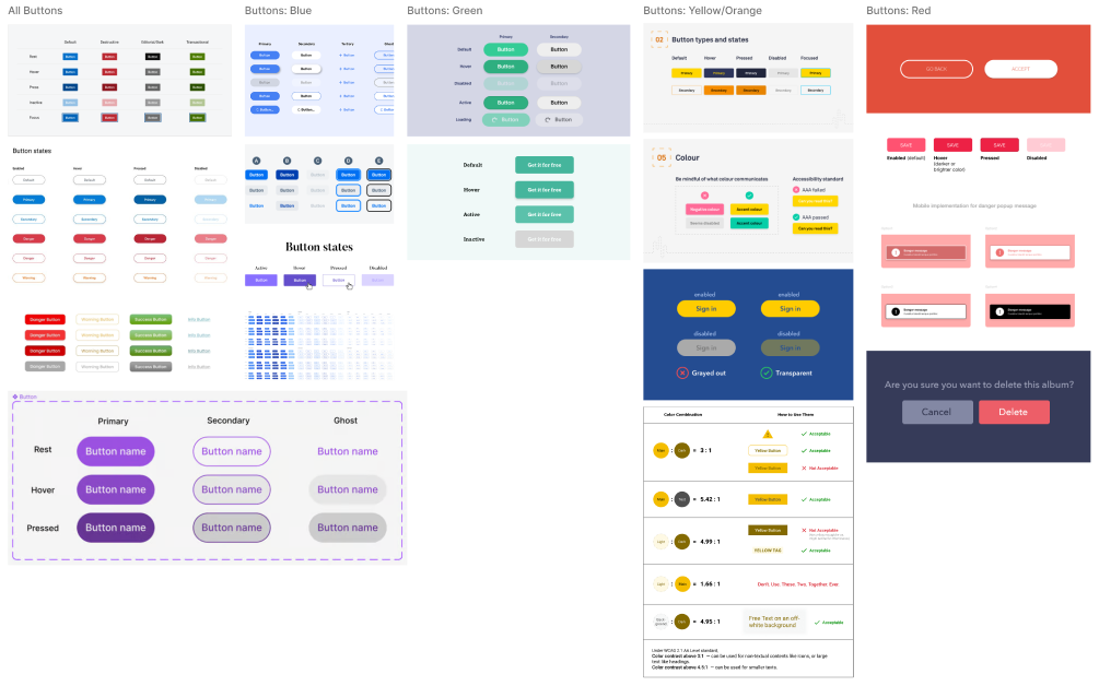
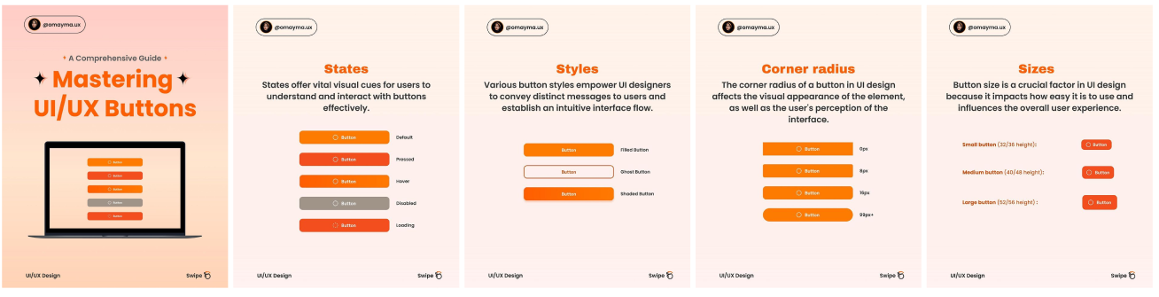
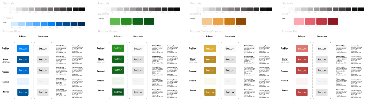
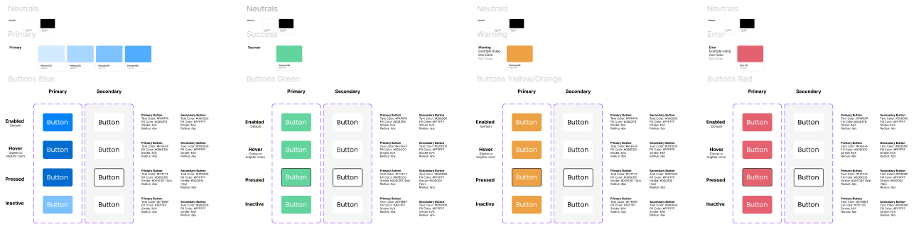
I designed two sets of buttons: one based on the UX team's proposed semantic colors and another using only the approved colors from the current branding guidelines. The semantic color buttons featured detailed specifications for various states (enabled, hover, pressed, inactive, focus) with variations in text color, fill, stroke, radius, and drop shadows. The approved-color buttons demonstrated the limitations of the existing palette, emphasizing the need for more nuanced UI elements to address different button states effectively.
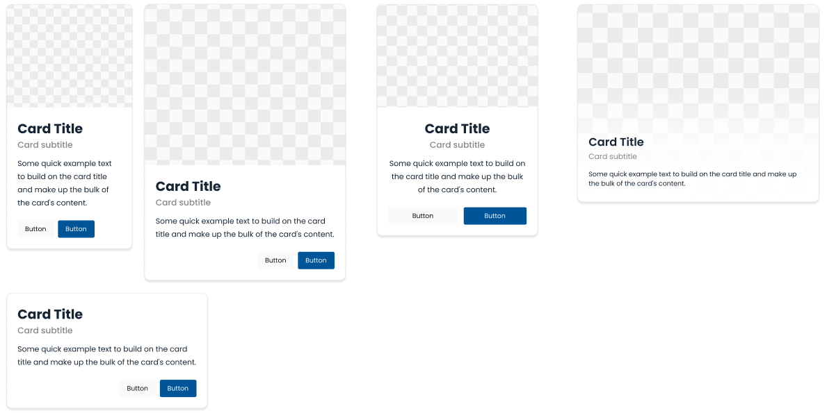
Cards
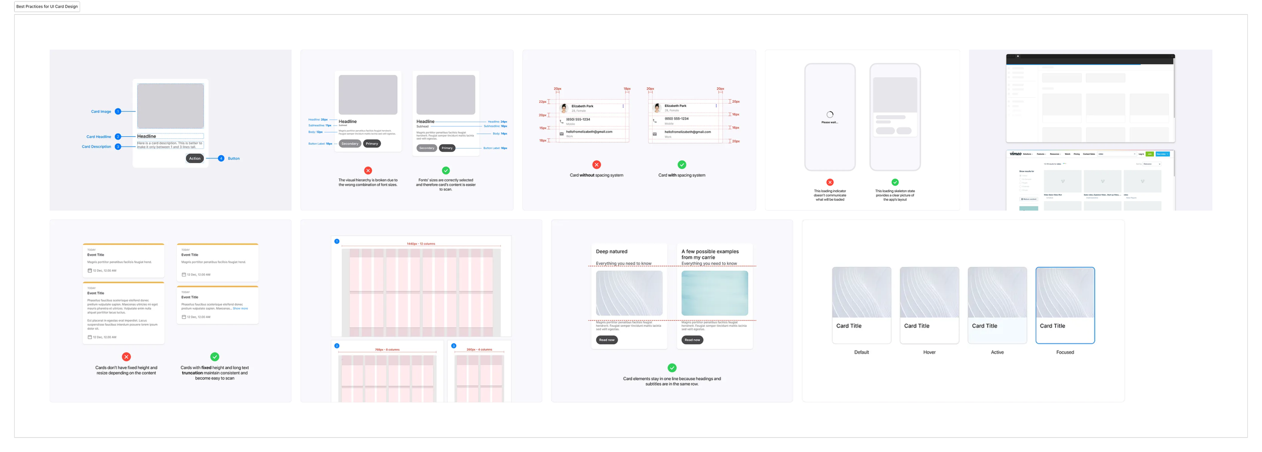
I conducted a thorough review of all the existing card components on the website to identify any inconsistencies and pinpoint design patterns the UX team could standardize. Afterward, I researched best practices for UI card design, focusing on key aspects such as features, visual hierarchy, spacing systems, fixed heights, and essential UI elements. These insights informed our design approach, ensuring that our cards are not only consistent but also adhere to industry standards for usability and aesthetic appeal.
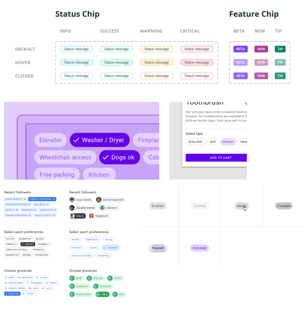
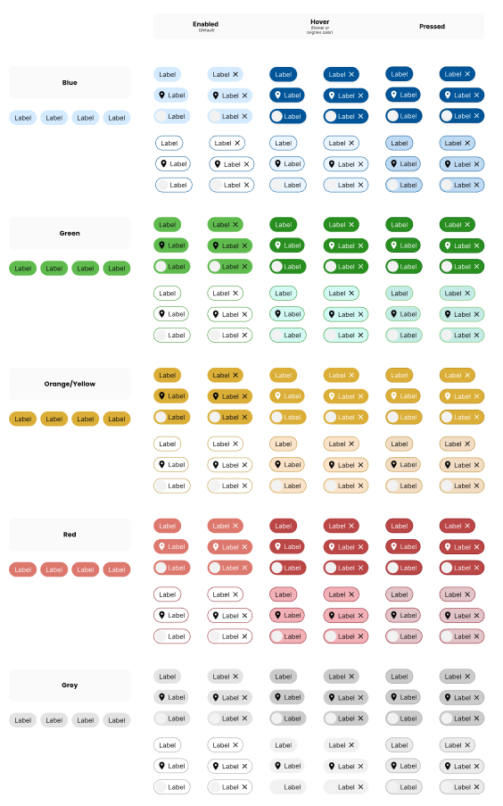
Tags/Chips & Icons
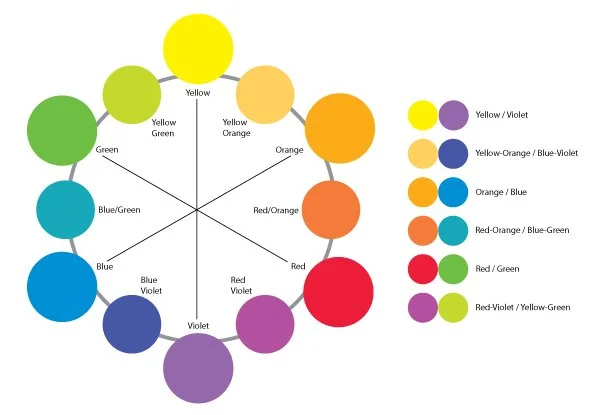
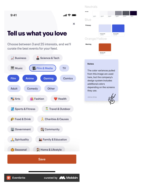
To create the tags and chips for Midland's website, I researched various examples to guide the design process. I developed color-coded tags and chips using blue, green, orange/yellow, red, and grey to visually differentiate categories. These tags dynamically change based on their states, offering users a quick and intuitive way to identify and navigate content on specific pages. Additionally, these icons are interchangeable. (The icons used in the design are placeholders, as the final set of approved Midland icons has not yet been provided.)
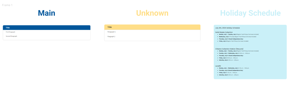
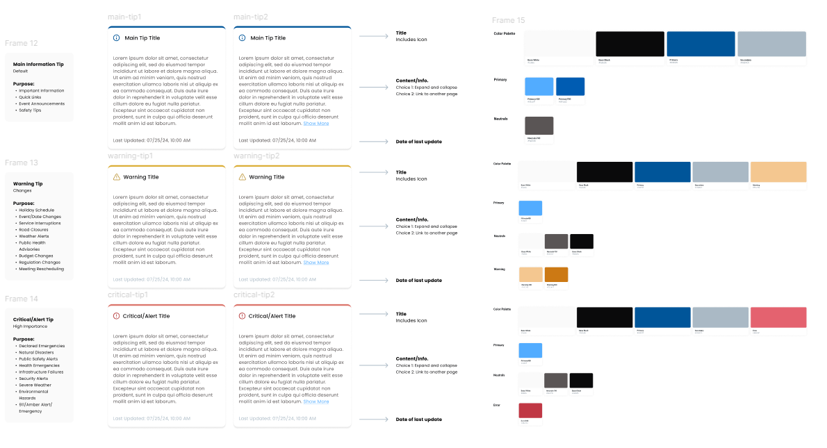
Info Tips
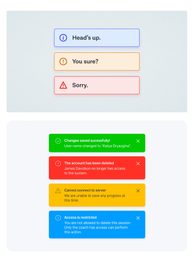
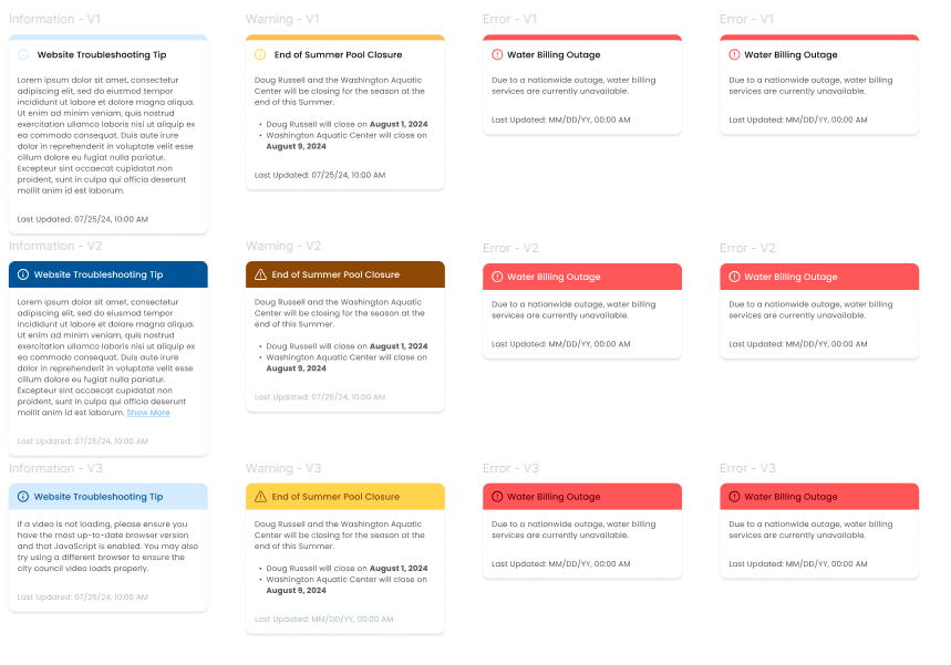
I evaluated the existing info tips on the website and researched similar systems used by other organizations. The goal was to create a clear, intuitive visual system that users could easily understand based on color and context. After reviewing different examples, I established a set of guidelines for how each info tip color would be used, ensuring consistency and clarity across the site.
- Blue (Default): standard announcements such as events.
- Yellow (Changes): temporary changes, including holiday schedules and road closures.
- Red (High Importance): urgent alerts like severe weather warnings or declared emergencies.
Once the categories were defined, I collaborated with the UX team to refine the visual elements. We integrated icons corresponding to each alert type (informational, warning, critical) and ensured the color scheme aligned with the branding while also meeting ADA compliance standards.
Tables
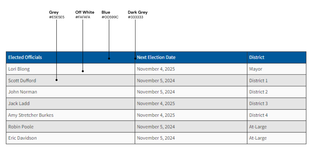
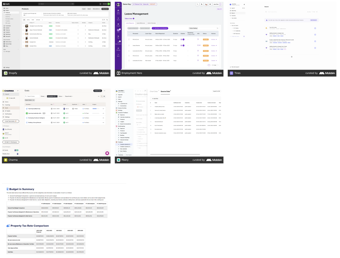
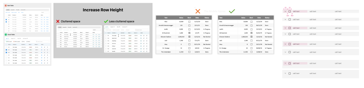
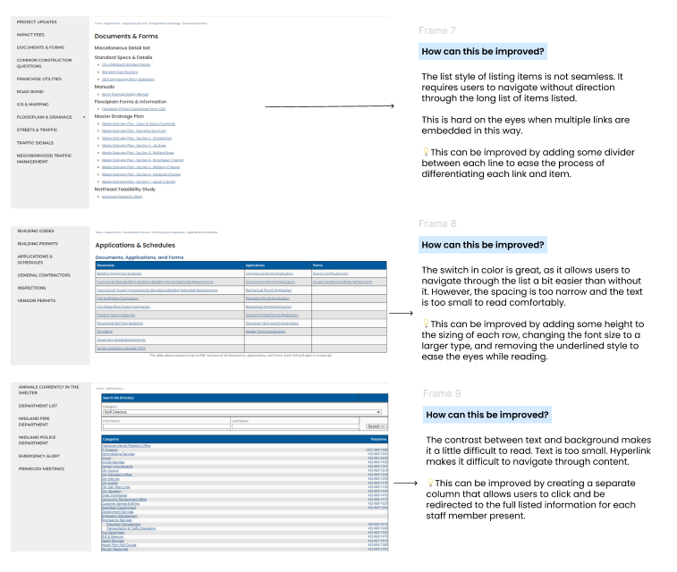
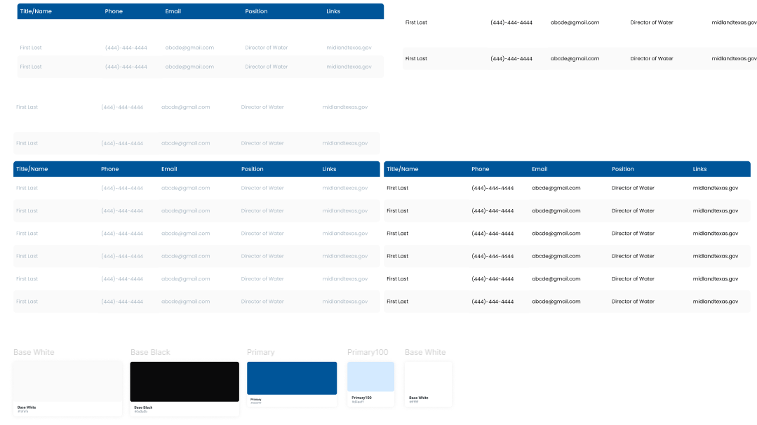
To enhance our table design, a team member researched best practices and analyzed the current layout. Key improvement areas included streamlining item listings, increasing row spacing, and enhancing text-background contrast for better readability.
- Why This Works: aligns with the Midland Style Guide — clean and user-friendly, alternating row colors ease navigation, and simple text enhances readability.
- Use Cases: organizing complex information such as staff directories, important documents, and resources.
- Rule of Thumb: use tables when presenting a wide range of information in a single area; keep to no more than 10 rows for clarity.
FAQs
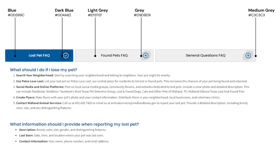
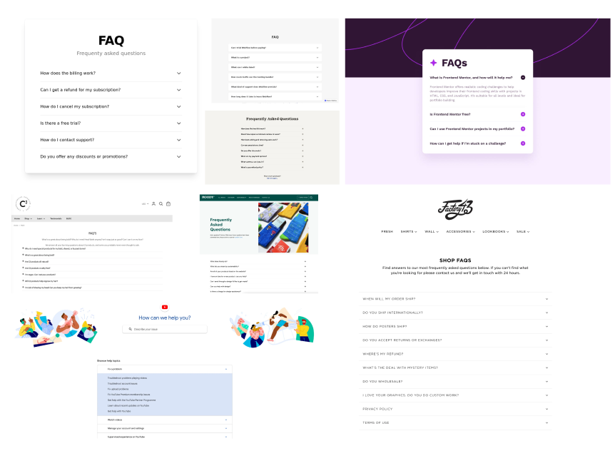
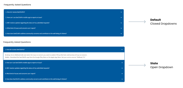
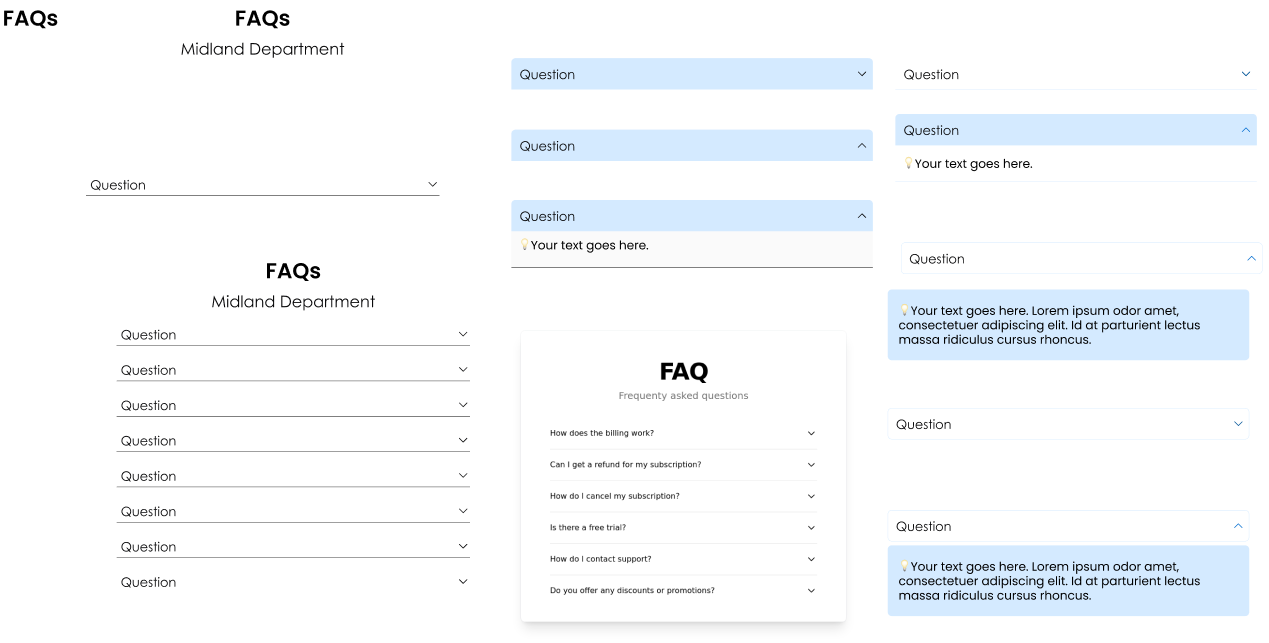
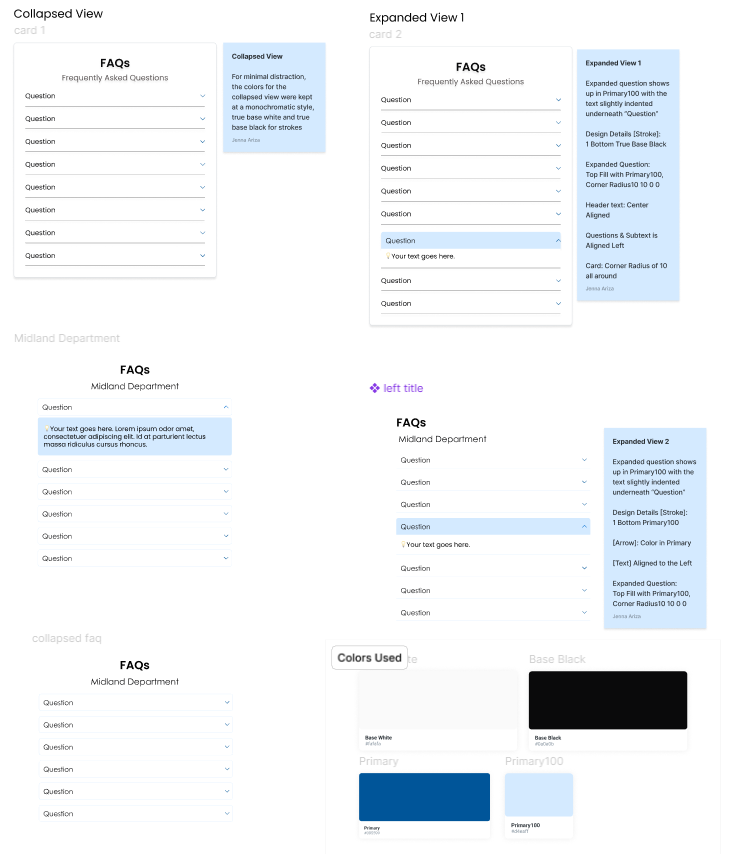
A key member of the UX team researched best practices for FAQ components to identify effective designs. I ensured she included examples of the existing custom HTML/CSS dropdowns to highlight the differences and enhancements in the new designs. After creating several options, she documented the rationale behind each FAQ dropdown to provide stakeholders with clear reasoning for selecting the proposed designs.
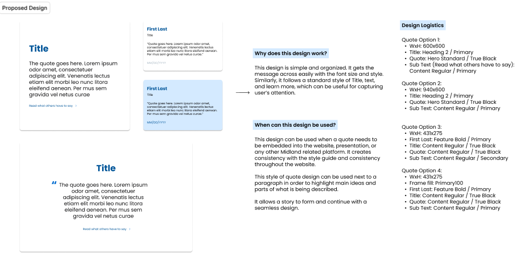
Quotes
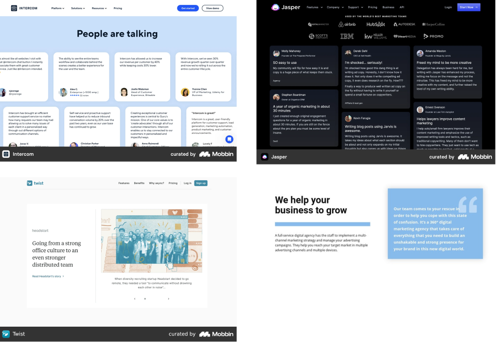
The UX team also reviewed various approaches to presenting quotes on websites. Several designs were drafted, detailing the proposed colors and design logistics for easy selection. The team emphasized the effectiveness of the chosen design, highlighting its simplicity and organization. The clear font size and style convey the message efficiently. The layout follows a standard structure — Title, Text, and Learn More — which effectively captures users' attention.
🤞 Outcome
During our work on the redesign of the branding and design system for the City of Midland, TX, the UX team encountered significant pushback despite our extensive efforts and numerous meetings. While this was frustrating, we viewed it as an opportunity to enhance our designs and thinking processes. We strengthened our rationale with additional research and presented our findings in various formats, including Figma slides, detailed content documents, and screen-sharing sessions.
As a result of our collaboration, a new brand guidelines document was created. However, the UX team's recommendations were limited to defining the primary and secondary fonts, the size and proportions of the logo, and providing specifications for the primary and secondary colors, including CMYK, RGB, and Hex codes.
Although the new branding is more detailed than the previous version, we are proud to have contributed insights that will inform future improvements. This experience has been invaluable for our team, allowing us to learn and grow, and we remain optimistic about the future of Midland.
📄 Brand / Style Guide
🔮 Future Enhancements
If I could go back in time to enhance Midland's Design System & Branding, I would consider the following improvements:
- Actively push the importance of the design system and branding proposed by the UX team.
- Build a detailed presentation, utilizing previous branding colors.
- Investigate additional design element options from Civic Engage for the June '25 Redesign.